Background
This project began with the Late Onions App, designed to help people find grocery stores that open beyond typical working hours.
Goals
In this second phase, my goal is to design the product’s website based on the application.
Challenge
The main challenge in this project is to maintain continuity in the user experience. Going through the website and looking for stores should be identical to the same task on the app. This means a similar structure, experience, and look and feel.
Tools used in the proccess
Paper, post-its, figma, browser
Secondary research
The process began by carefully observing the duality of app and website for some well-known products such as Airbnb and Leboncoin. I noted the way the menu changed shape, where to find the search bar, and how items were displayed.
I also observed where the eye was drawn on the first page, how the structure adapted to fit the device, and how the experience was similar and different on each device.

Outline
I started this research thinking that it was important to maintain the exact same elements in the exact same order on the website as they are on the App. However, this research showed that the transition from App to website can be more flexible and allow for some variations without compromising the user’s experience.
Features
Having observed the responsiveness of other products, I felt ready to ideate on the website. This step is about deciding what to keep, what to add, and what to transform.
Keep, add, transform

Information Architecture
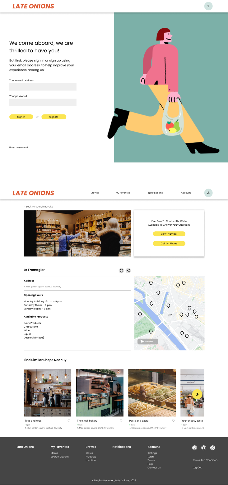
Based on the research and the Late Onions app, the information architecture for the product’s website follows the diagram below

Paper Wireframing
The most efficient way to put shapes on ideas. In this example I made wireframes for the homepage.
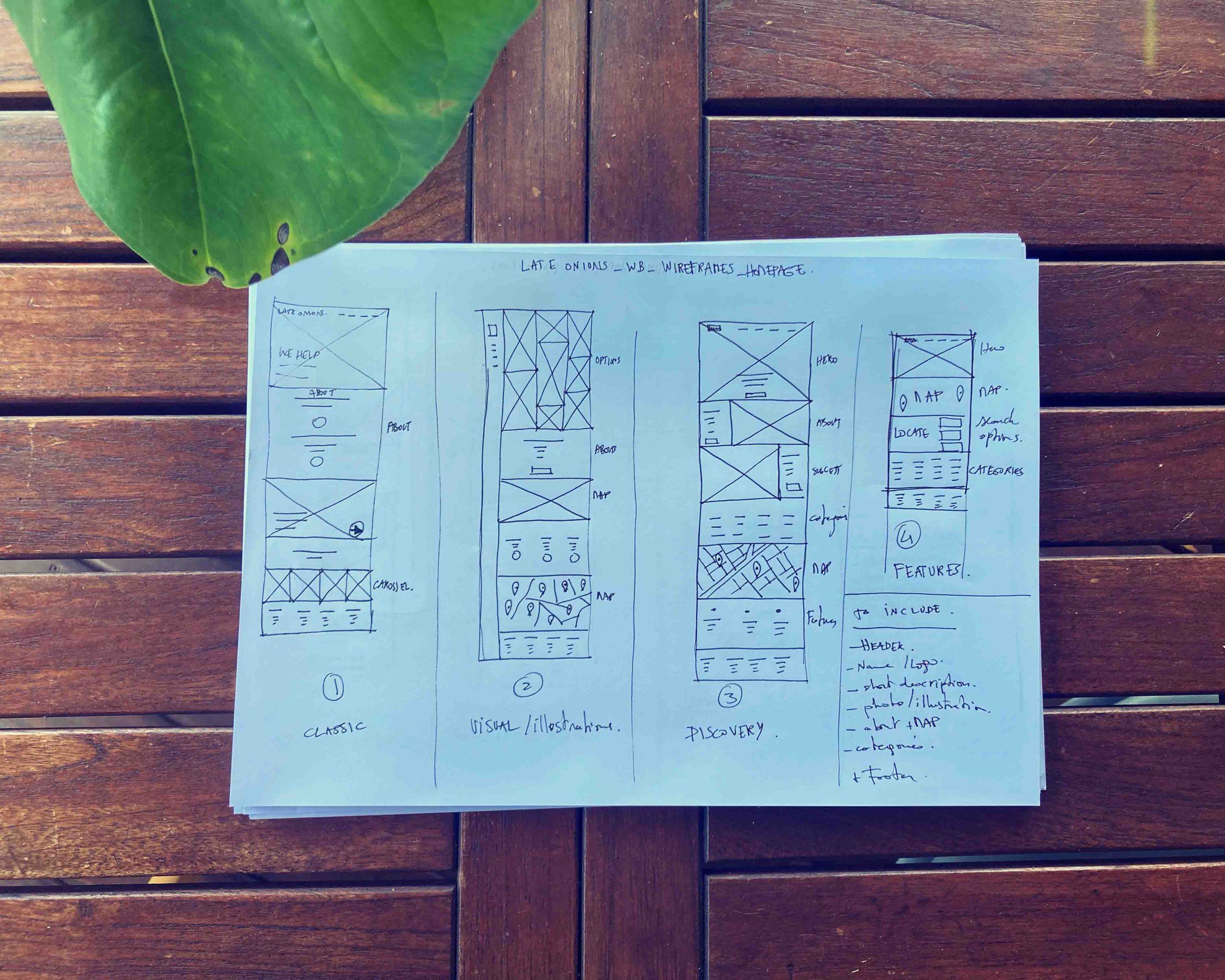
Lo-fi wireframes and prototyping
This low-fidelity prototype proved to be useful in the following study. Users tested the product and were able to provide valuable feedback.
Testing
The low-fi prototype was tested with three participants, who had also tested the app. They were asked to complete the following tasks:
- Search for a store by location. Follow-up question: Was it easy to enter your address? Can you comment on this step?
- Search for a store by category. Follow-up question: Did you easily find your desired category? Were the categories clear enough? Were there too few or too many categories? Can you comment on this step?
- Search for a store by opening hours. Follow-up question: Was it easy to define the hours you need? Was there anything missing in that step? Could you please evaluate this process?
After conducting the tests, I organized the data.

Insights
The results allowed to ideate further on the website’s layout and IA.
→ The homepage will be reviewed, the landing should be more useful and less visual.
→ The search bar should be more upfront, it’s a very useful tool.

80% of users were looking for the search bar on the homepage

100% of users completed the tasks
Improvements to the final prototype
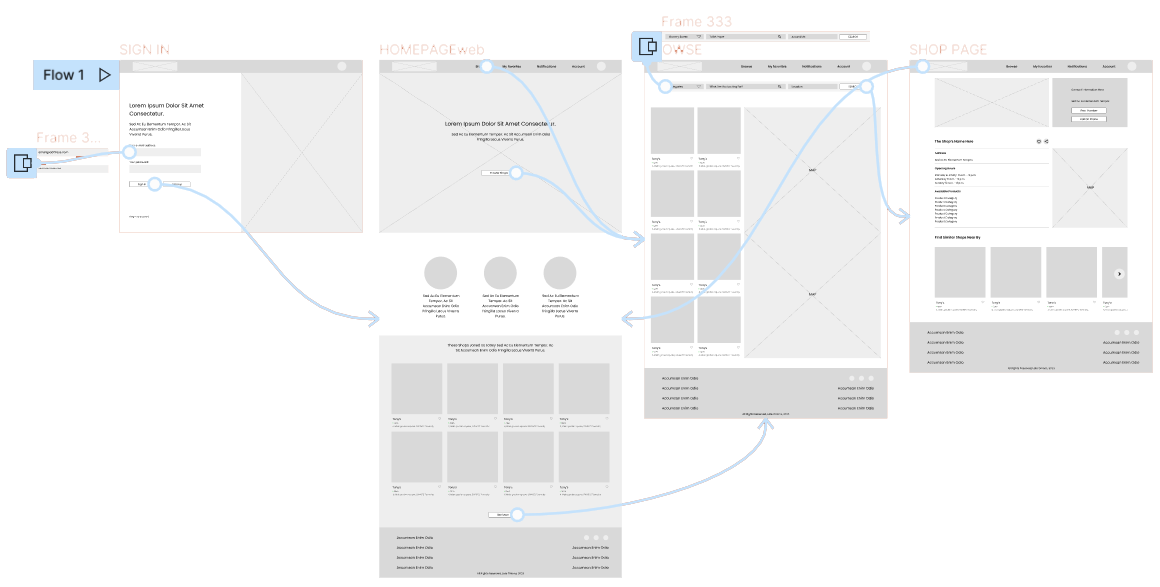
Based on the insights from the study, the pages were reviewed to address the users’ expectations. Below is an example of the modifications made to the homepage.

Final prototype
Some modifications were made before finalizing the prototype. A final review was conducted to ensure that all the appropriate UI elements and components were used.
An overview was essential to harmonize the screens and ensure continuity was maintained.
You can view the final prototype in this video.
When I started this project, I aimed to create a 100% identical app/website experience. However, the research and design showed that although it’s important to maintain continuity, each device is different, and each experience is unique. Therefore, the goal should be to maintain continuity, consistency, and design according to the context. The experiences should be complementary, not fully identical.