The project started in 2022 when a couple of friends who have been living on Réunion island for over two years decided that it was about time to build a useful platform for culinary experiences and products.
They used to live in metropolitan France and were used to a certain level of comfort and ease when they used to search for a product or a restaurant.
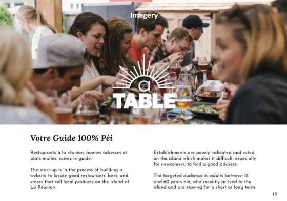
The experience of looking online for a place to shop or go out quickly became frustrating on the island: the addresses are poorly indicated, the information is often incomplete, or it is not mentioned at all.
Their goal is to create a platform where finding a place to eat or a place to shop is easy, fully informed, and enjoyable.
The client
The client is a couple of friends from different backgrounds with a shared passion for food. One of them is the chef of her restaurant, the other one works in finance. They both have a shared interest in good culinary experiences and products.
The audience
The targeted audience is: adults between 18 and 60 years old who have recently arrived to the island and are staying for a short or long term.
Goals
- Develop the brand’s design, look and feel.
- Design the website and web application.
Time to complete the mission
1 month alongside other projects + client meetings
Tools used in the proccess
Paper, post-its, figma, browser

Naming the brand
In order to help the client come up with a name for their brand, we came up with a map of all the adjectives, places, feelings, and places that evolve around their brand.
We aimed to find a brand name that would align with the brand’s feel. One that is professional, local, cozy, and “gourmand.”
The mapping helped us to brainstorm lots of ideas. Afterwards, we narrowed down the naming options to three proposals:
- Island plates
- à Table
- Saveurs locales
The chosen name was finally: à Table.

The brand’s look & feel
How can we design a restaurant guide’s look and feel? What does an online restaurant guide look like? And where do they come from, historically? What are some common elements that we should include in our design to help the user’s experience, such as layouts, colors, and typography? Which elements are up for innovation and experimentation?
These are the questions that needed answers through the secondary research. We first researched historical guides, then we analyzed contemporary references and other online guides. We observed the color chart, the typography, the website, the layout, the constitutional elements, and the brand modularity.


Typeface
Choosing the typeface is crucial for the brand. We started the procedure by selecting five serif and sans-serif typefaces that align with the brand’s 4 pillars: professional, local, cozy, and “gourmand.”
From there, we played with the 5 skeletons to create variations, possibilities and first drafts.

We agreed to a first selection of typefaces
Finally, we agreed with the client to choose the following typeface combination :

Color palette
After careful observation and study of the food industry’s colors, we came up with the brand’s color palette: harmonious, strong, and complementary. We found it to fit both the brand’s identity and the island’s colorful spirit.

Mark/icon
The icon is modular, its shape can grow to form a full icon of the sun. They rays can also change their length.
The icon can work as an animated button.

Testing with typefaces
We tested a combination of primary and secondary typefaces, both serif and sans-serif. The goal here is to find a correct balance between the contemporary and the classic – inherited.

The final choice
The final typefaces are: italic Lora, a dreamy, savory typeface with character, as the primary typeface. And Josefin Sans, a sober, pragmatic typeface, as a secondary typeface for the content.

The imagery
We opted for feel-good, cozy, and rich photography, similar to the brand’s feel. We chose to stay away from minimalistic imagery: it wouldn’t be right for this project.
Mock-ups
Mock-ups of the guide’s annual printed version


Mock-ups of the stickers to display on the restaurants’ doors


Mock-ups of contact cards designs


It was thrilling to work on brand development and be a part of this project. Nowadays, the options for typefaces, imagery, and colors are almost infinite, which makes the choice even harder. It was important to keep the brand’s identity in mind and stay focused on the website’s purpose. The project is still ongoing and will be published soon.