Late Onions: a case study
Background
I was inspired to start this project by a real-life dilemma my colleagues and I faced when working beyond regular office hours. With long and busy workdays, grocery shopping often became a task that slipped away, leaving us with nothing but delivered meals for dinner.
Navigating Google maps and search results for grocery stores that are open beyond working hours can be overwhelming.
The goal of this project is to help working adults (between 18-50 years old) locate grocery stores that are open before or after work hours so they can easily complete their grocery shopping.
Goals
The application allows users to obtain specific results that cater to their precise needs, such as product availability, location, and opening hours. Users will have the option to save their favorite results or stores for future reference.
Problem
The target users are busy per se, often avoiding searching for alternative options to purchase groceries or missing items due to time constraints. As a result, they frequently end up ordering low-quality food.
Impact
Late Onions provides recommendations and results that match the user’s specific needs, allowing them to obtain what they need with minimal effort. This is where the app proves useful for the targeted users.
Goals
The first study aims to determine the usefulness and coherence of the app’s features by discussing the following subjects:
- The various situations where users could use the app.
- The frustrations users experience when looking for stores online.
- The patterns behind alternative solutions, such as delivery and ordering out.
- The expectations of users.
Methodology
The research includes user interviews with four participants who aim to establish healthier habits despite working late, as well as market research on top apps that offer a list of products. This will enable us to study and learn from the interface, user flow, and necessary steps to reach the endpoint.
Outline
The discussions have given me confidence that the app will be useful. The users seek a comfortable flexibility in their daily life. They need to have the ‘search by location’ feature at their disposal.
It’s crucial that the app remains easy to use and straight to the point, as people will use it when they’re in a hurry. Therefore, it needs to be intuitive. The next step is to list the app’s features from least to most valuable
User persona
Meet Billy, the persona representing the main user group’s goals and frustrations. Billy is here to tell their story. When in doubt over a strategical choice or a design choice, I can think about Billy how they would like to have the app work for them.
Features
After researching the necessary features and defining the personas, I decided to take it a step further and brainstorm ideas for the actual features. The goal is to make the app easy to use on the go.
This requires an intuitive interface. The research has provided enough information to determine which features will bring low versus high value to the user. The next step is to categorize these features.
Values: high value to low value
Multiple flows
This step was necessary in order to determine whether the user’s flow is as simple as it could be.
Task 2: look for the household items within a specific perimeter
Lo-fi wireframes
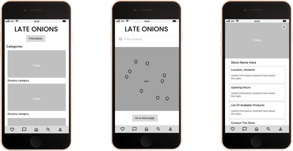
The first set of low-fidelity wireframes came in handy for the usability tests. They were made quickly and efficiently as a first draft of the layouts, menus, functions, buttons, and visual proportions.
Ui components
Testing
The low-fi prototype was tested with 3 participants who were asked to complete the following tasks:
- Search for a store by location. Follow-up: Was it easy to enter your address? Could you comment on this step?
- Search for a store by category. Follow-up: Did you easily find your category? Are the categories clear enough? Are there too few or too many categories? Could you comment on this step?
- Search for a store by opening hours. Follow-up: Was it easy to define the hours you need? Was there anything missing in that step? Can you please evaluate this process?
- Create a profile from the home screen. Follow-up: How would you rate this step? Is there anything you would like to change about the process?
Insights
The results allowed to ideate further on the app’s features.
- The profile page is not really necessary since we have too many communication platforms as it is.
→ The profile feature will be removed, and a simple account with basic information will suffice for the app. - The search by category is overwhelming and the product categories should be simplified.
→ It would be interesting to check out some supermarket’s main product categories system. - The settings page interface is outdated.
→ Review the page and make it consistent with the rest of the app.
100% of users are willing to download the app once it’s available
80% of users completed all the required tasks
100% of users found the “search by location” option to be easy to use
Hi-fi wireframes
Splash screen

Search filters
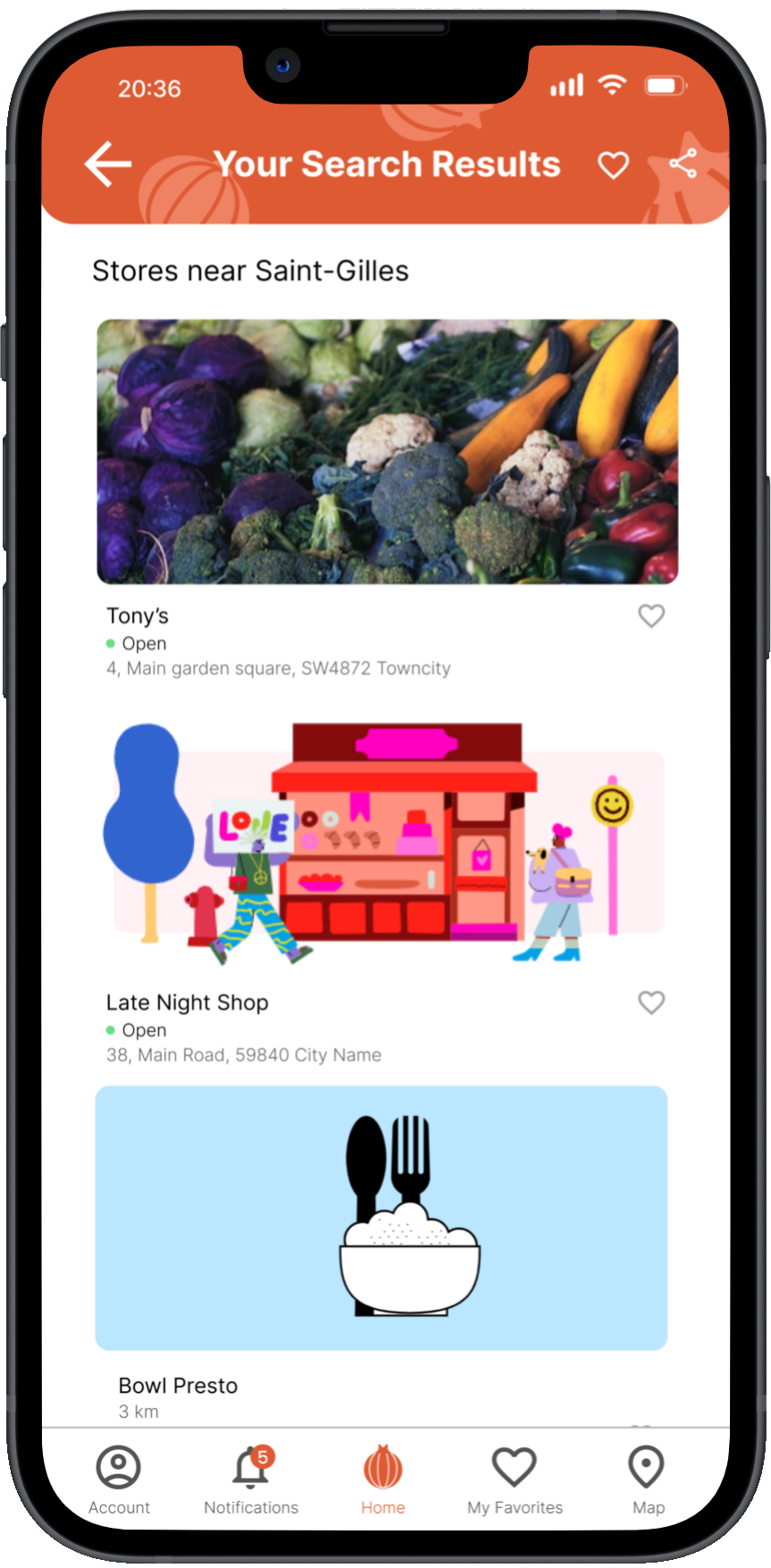
Search results
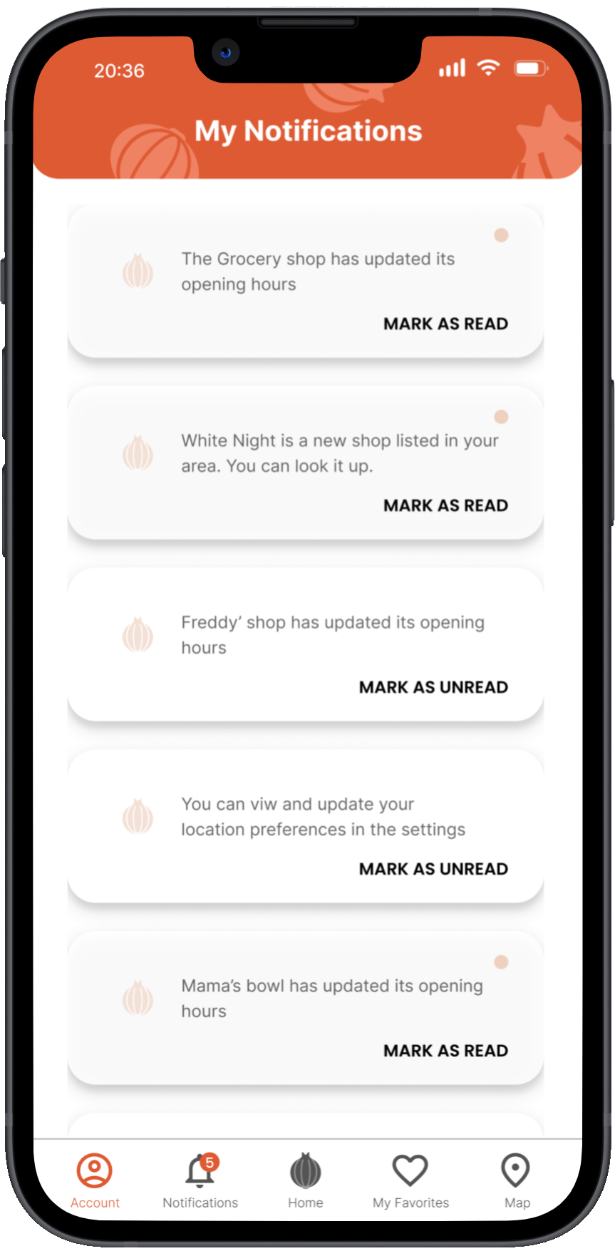
Notifications

Account settings
Improvements to the final prototype
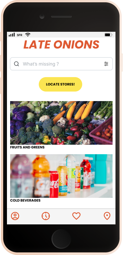
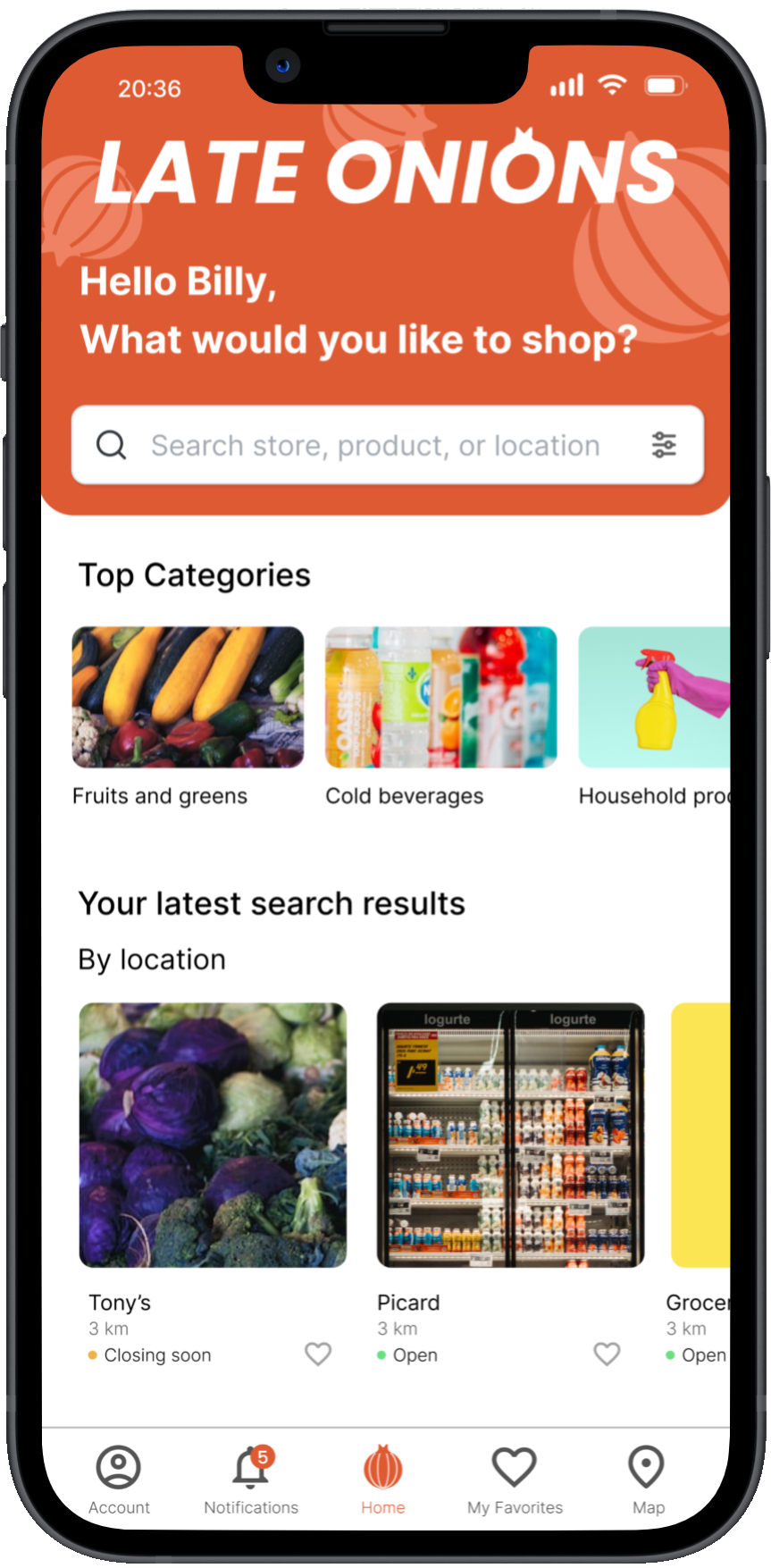
Homepage: before and after
- The “locate stores” button has been removed as it serves the same purpose as the search bar.
- Guidance to help people use the search bar has been added.
- The images and initial categories were taking up a lot of screen space, so they have been narrowed down. Users can see other suggestions based on their preferences.
- On the lower tab, titles have been added alongside the icons to improve the experience.
- On the lower tab, the homepage button has been added as the app’s logo doesn’t show up on all pages. The search history button has been replaced with the notification center button.
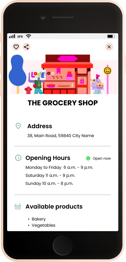
Store page: before and after
- The font size has been reduced to be more coherent with the rest of the app pages.
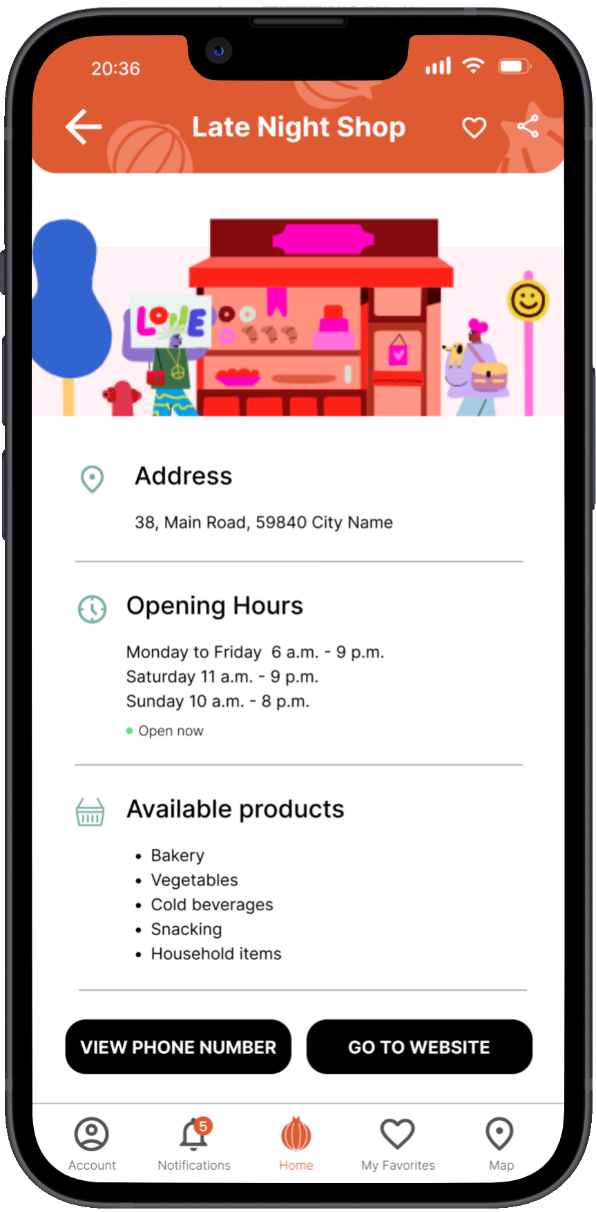
- Two fixed buttons have been added to allow users to view the phone number and go to the website. The goal is to help users access information more quickly without having to scroll all the way down.
Final prototype
Several modifications were made before finalizing the prototype. A final review was conducted to ensure that the correct UI elements and components were used.
An overview was crucial to harmonize the screens and ensure that continuity was maintained.
You can view the final prototype in this video.
Trust the research process.
Some users’ needs and frustrations were unexpected. This project showed me that the way a user views and walks through the app will be different for each person.
A feature might seem interesting or fun, like creating a profile in this example, but it was perceived to be an additional and unnecessary load for the user.
The designer’s intuition matters but in the end, the user’s experience is the focal point.

