Aurizon: facilitating the job post & search procedures
Background
Client: Aurizon, Australian rail freight operator
Team: Liquid interactive – Client engagement, content writer, developers, and myself as UI/UX designer
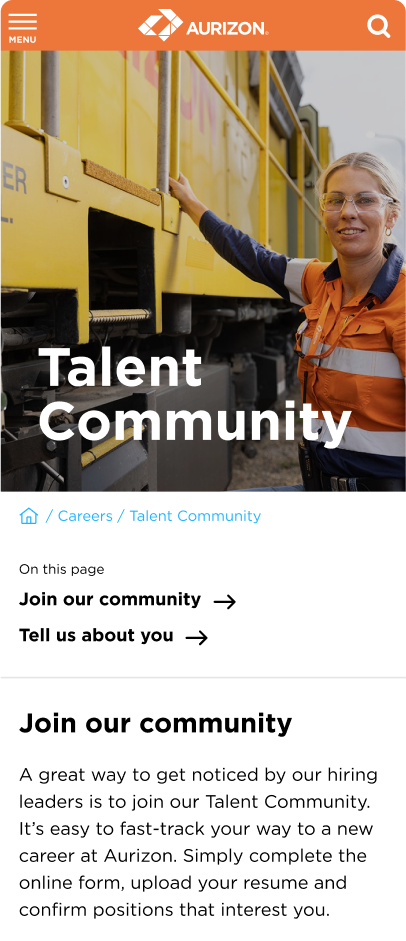
Contribution: lead designer – revamping the Careers section on Aurizon’s website and creating the Talent Community page.
Research and analysis, UI and UX design, design library, prototyping, responsive design, design testing, client meetings, photo editing.
Visit: https://www.aurizon.com.au/careers
Goals
Our team retrieved Aurizon’s website and was tasked with revamping and developing the Careers section in time for their new recruitment campaign.
The client’s objective is to increase traffic in the careers section by 20% over the period of 12 months.
Challenges
Timing was short. We faced a tight deadline of just a month and a half to complete all tasks, including research, design, development, user testing, design testing, and client feedback incorporation.
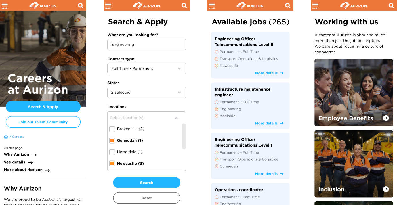
The initial job posts were managed by a third company. The developers had to extract the information from the RSS feed. This posed some limitations on UX interventions.
Although there was a need for significant improvements in the Careers section, the final product had to remain consistent with the rest of the website.
Approach
People browse jobs on different platforms. Each one of these platforms has its own way of working, which ends up presenting a challenge for the users, as they rely on consistency.
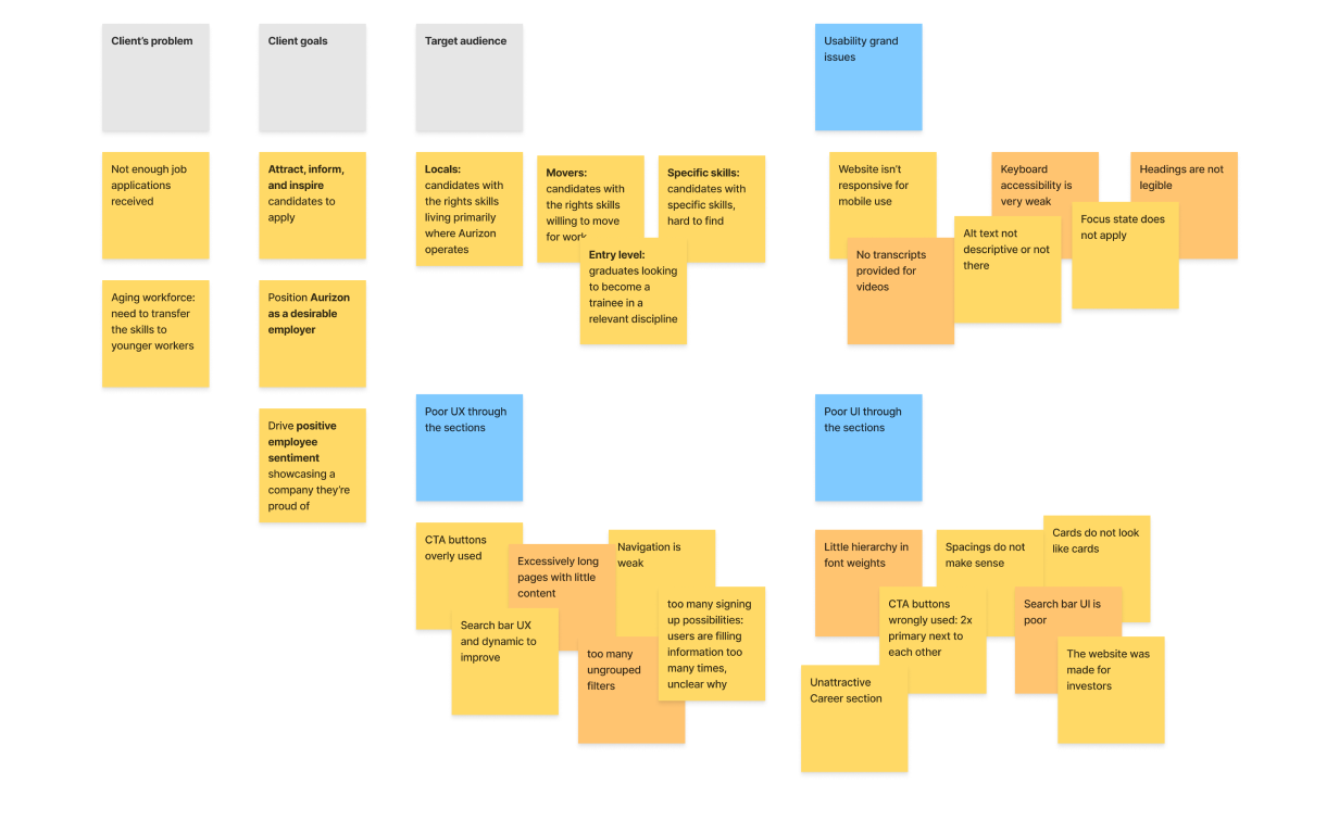
We started by an initial assessment of the current website to identify UX and UI issues, through an affinity diagram.
A set of design rules
Every design decision, whether minor or major, had to align with three key constraints: time, development, and consistency. After the initial research and analysis phase we set a set of design rules, such as:
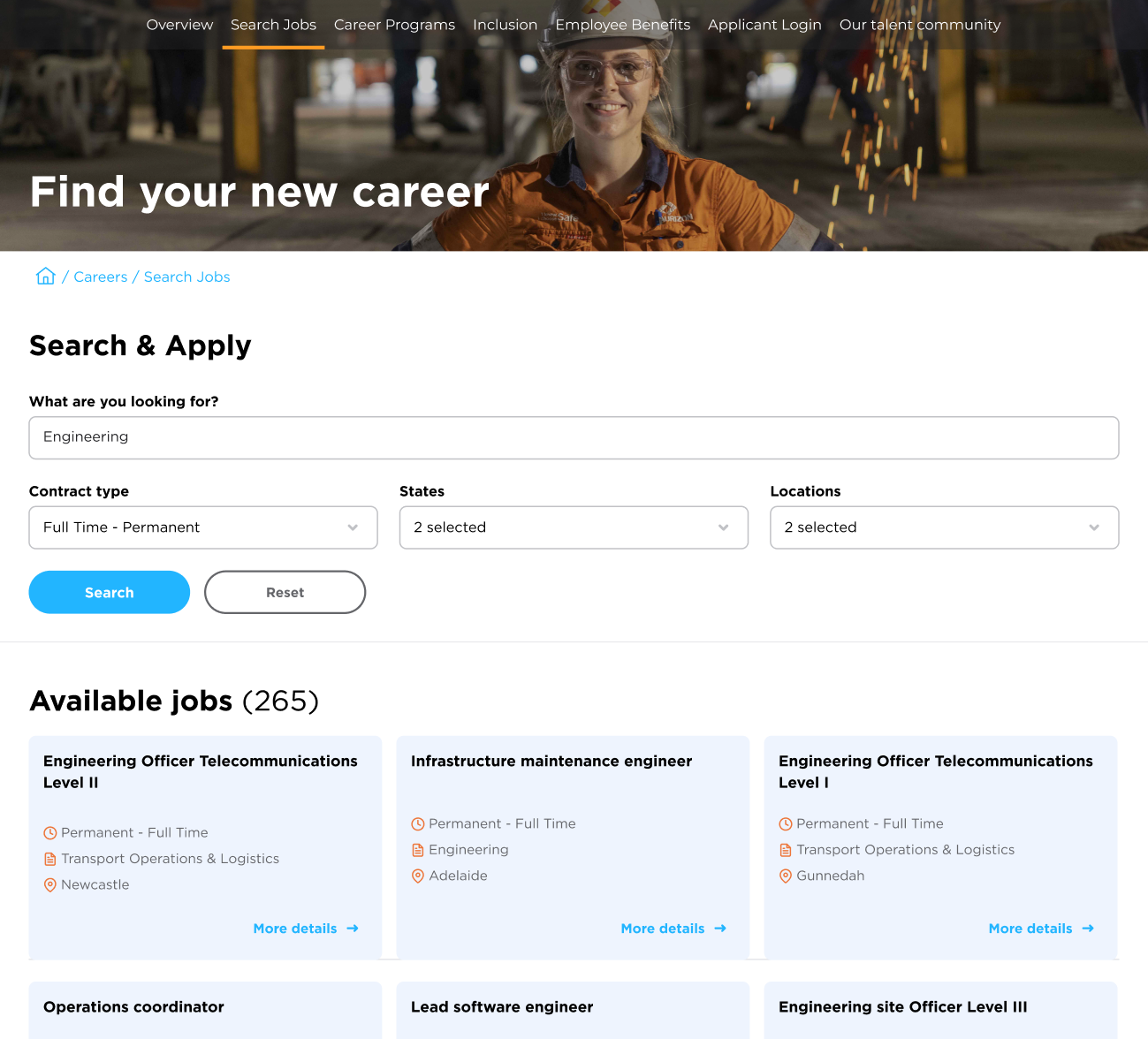
- Features that are causing major user experience distress have to be changed, such as the search bar, filters, and results page.
- Components should be faithful to their intended function. Spotlights should look like spotlights, cards should look like cards, even if this means having 2 types of cards on the website.
- The design must remain faithful to the Aurizon brand.
- We cannot add or subtract colors but we can use other shades
- We cannot add or modify typefaces but we can modify a typeface’s weight to make it more legible such as on a page banner.
- We cannot change the layout grid but we can change the page layout and spacings. If a page is overcrowded then we should create more breathing space.
Implementation examples
1
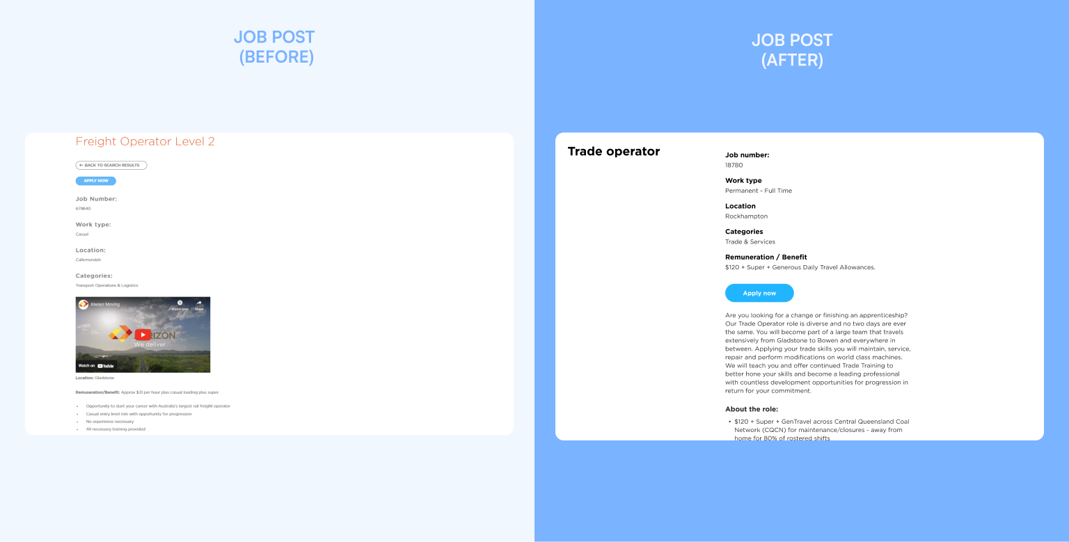
Job posts
UX heuristic: consistency and standards. Users should not have to wonder whether different words, situations, or actions mean the same thins. Follow platform conventions.
- follow the layout grid
- display the main information first, before suggesting to apply
- remove irrelevant information
- improve spacings and text accessibility
2
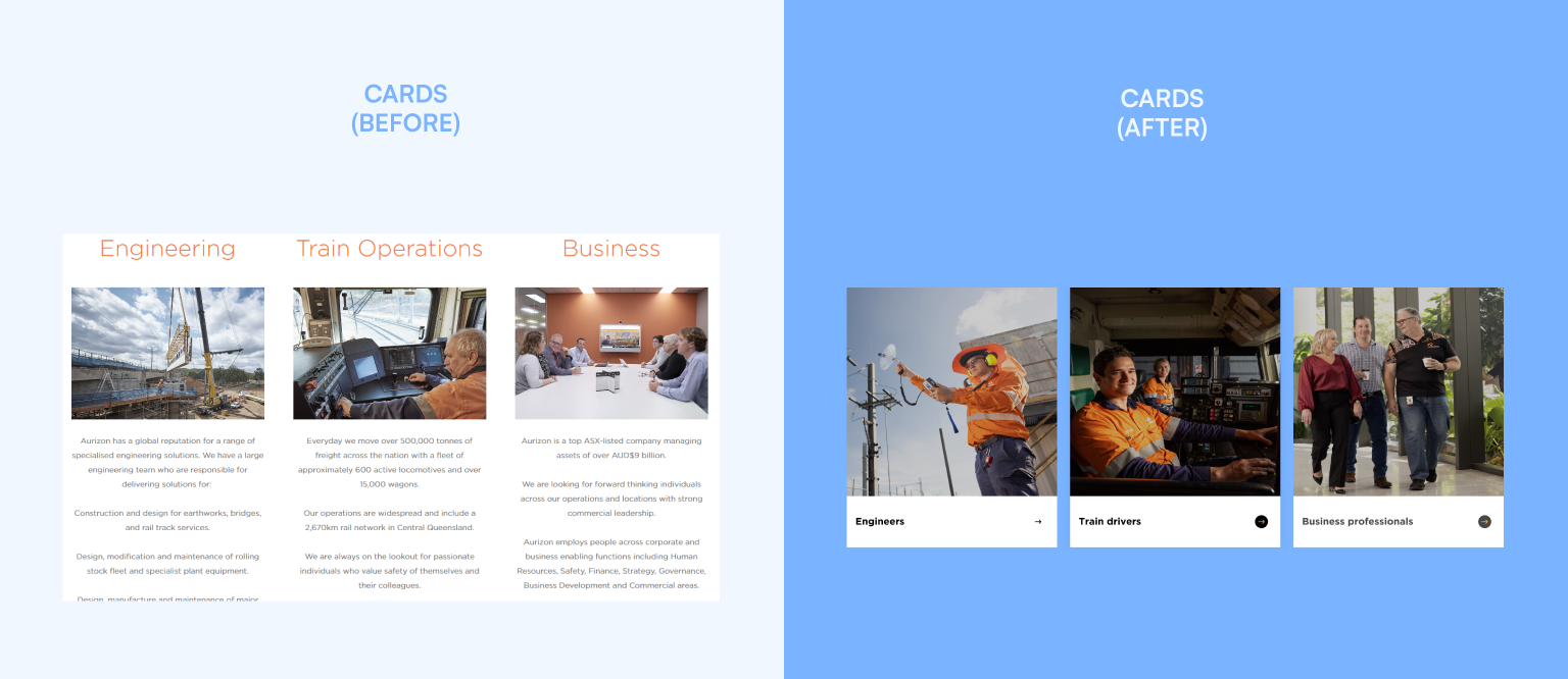
Cards
UX heuristic: visibility of system status. Designs should keep users informed about what is going on, through appropriate, timely feedback.
- clearly indicate the elements that are meant to be interactive
- provide recognizable components such as cards
- apply the different interactive states to UI such as hover and pressed
- follow industry best practices while designing the component’s UI
3
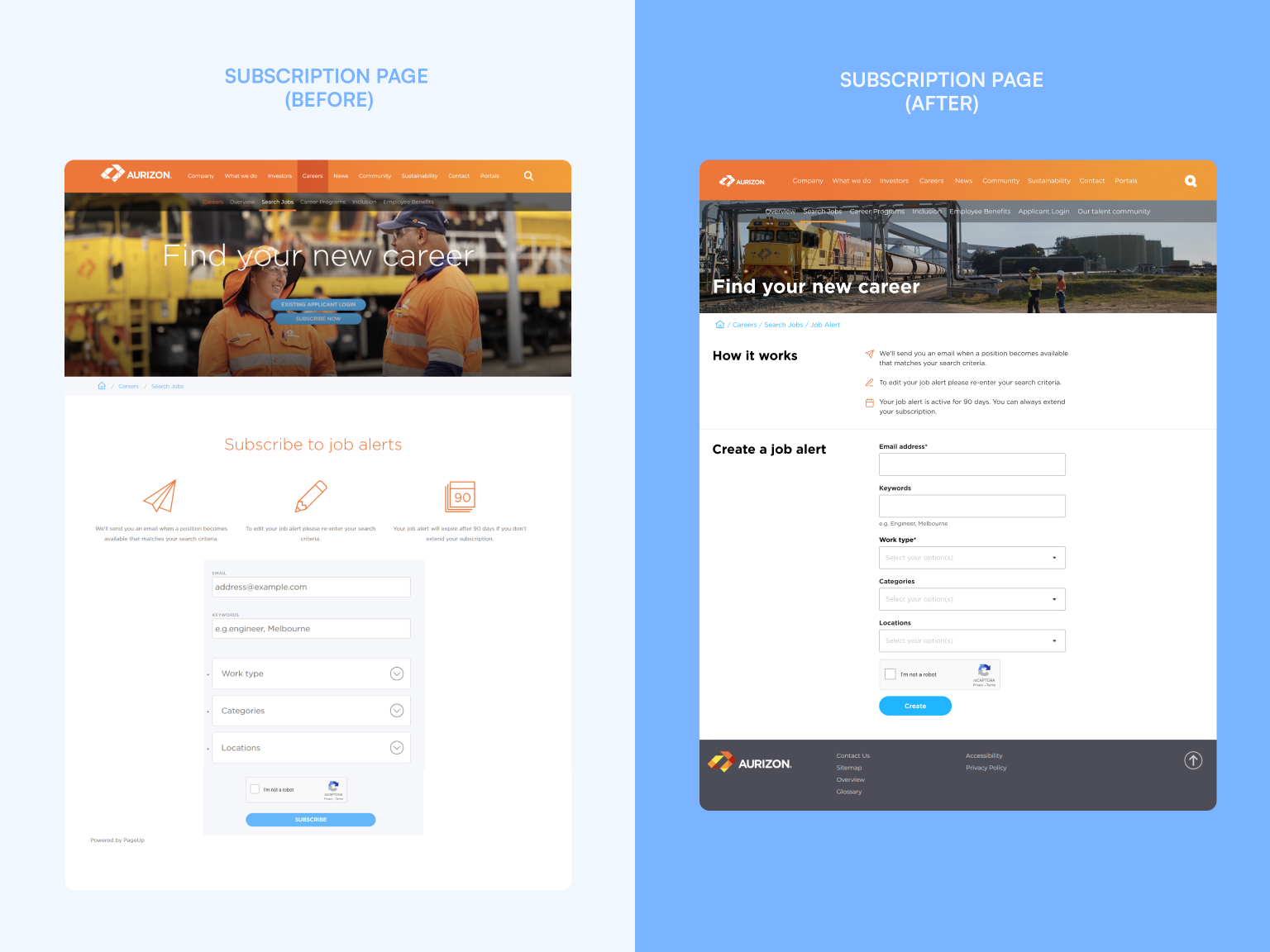
Subscription page
UX heuristic: aesthetic and minimalist design. Interfaces should not contain information which is irrelevant. Every extra unit of information in an interface competes with the relevant units of information.
- remove non identifiable elements that do not serve a clear purpose
- reduce the user’s cognitive load
- move misplaced CTA buttons
- provide and identify guidance
- follow the layout grid
- improve heading legibility
4
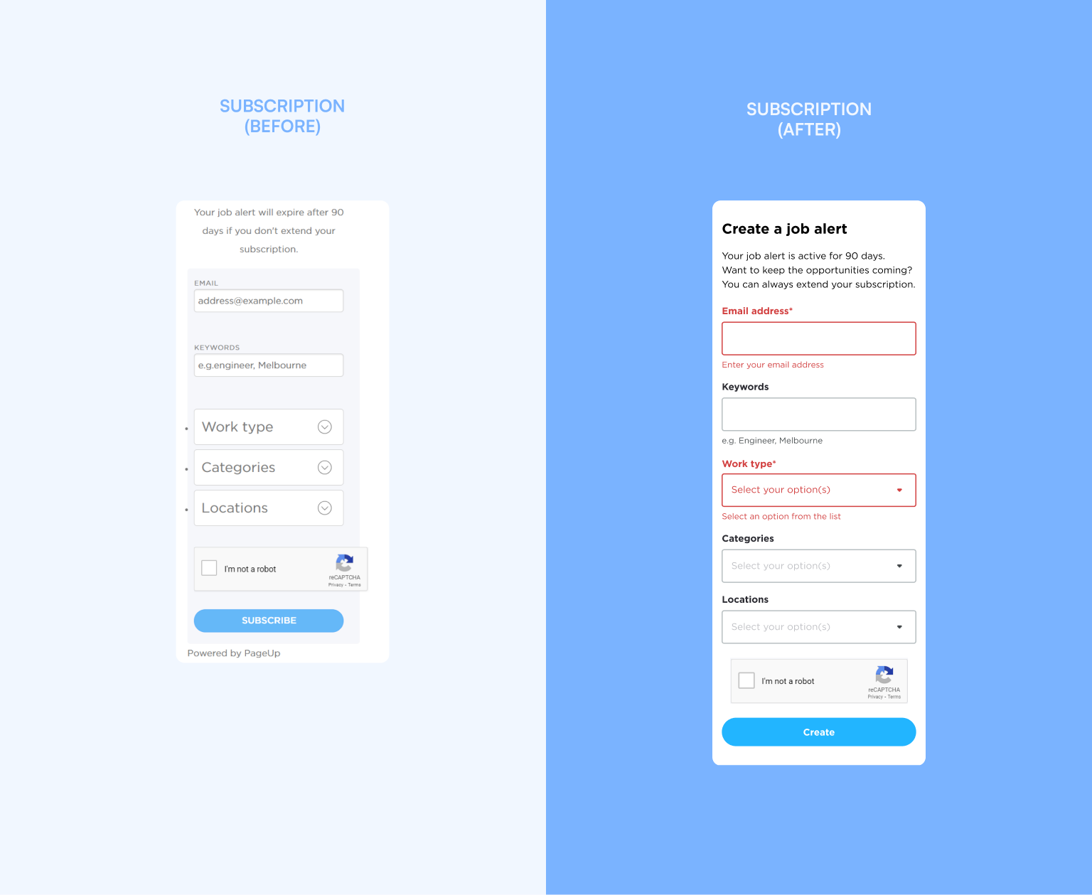
Subscription page – error
UX heuristic: recognize, diagnose, and recover from errors. Error messages should be expressed in plain language, precisely indicate the problem, and constructively suggest a solution.
- provide a summary of the errors
- describe errors in plain language
- provide a jump link to locate each error
- improve error visibility
- follow the layout grid
- provide a section heading
Results
+75.8%
New visitors (following month)
-7.04%
Bounce rate drop
+18.02%
Increase in mobile device use ratio
Upon the client’s request, our team is currently working on revamping Aurizon’s entire website, leveraging the insights and strategies developed during the Careers section project.