Nectar: carrying the passion for winemaking
Background
Client: société Nectar, Fr
Contribution: brand guidelines, UI and UX design.
Information Architecture, benchmarking, design library, responsive design, design testing, client and dev meetings, photo editing, illustrations.
Development: N/D.
Visit: nectar-degustations.com
Context
Nectar is a wine salon and shop in the north of France.
The client reached out with an existing logo and the initial development of a few pages built on a CMS platform. Their goal was to share their passion for wine and vineyards’ stories through their atelier.
This project is centered on creating a bespoke universe and experience.
Approach
Unlike interactive applications with extensive content, designing a commercial website is more about capturing users’ attention and creating a distinctive, immersive experience.
With limited resources, the project was approached as an “oeuvre totale”—an all-in-one direction that combined brand development with UI and UX design, instead of the traditional step-by-step process.
Design guidelines
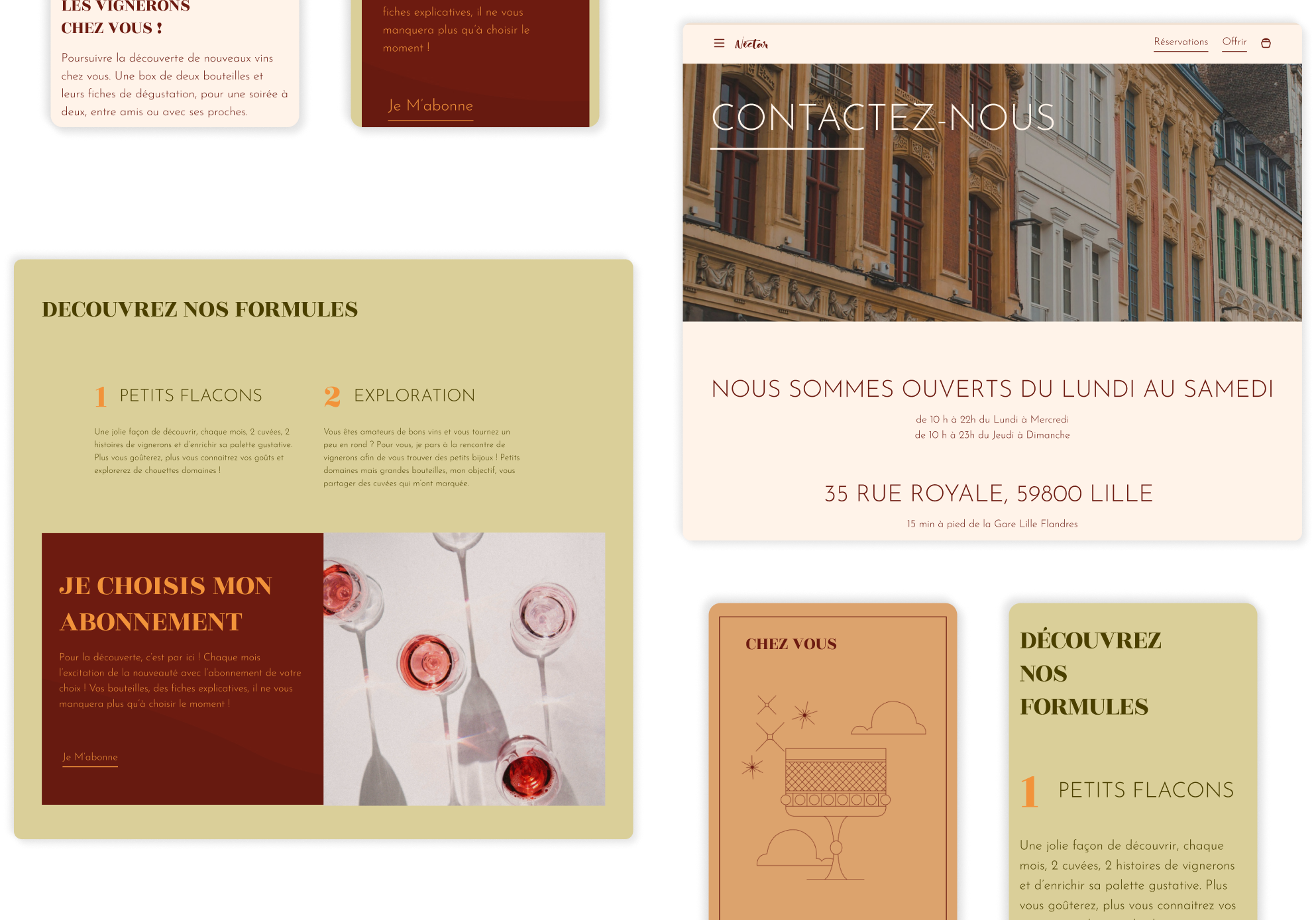
An initial workshop with the client determined the look and feel of their brand: elegant, warm, sophisticated, earthy, and inviting. This session paved the way for the design guidelines, in example:
- Shapes: sharp angles, straight lines, and geometric shapes were chosen over rounded corners and organic forms to reflect the brand’s sense of sophistication.
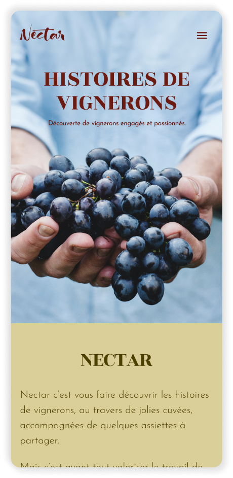
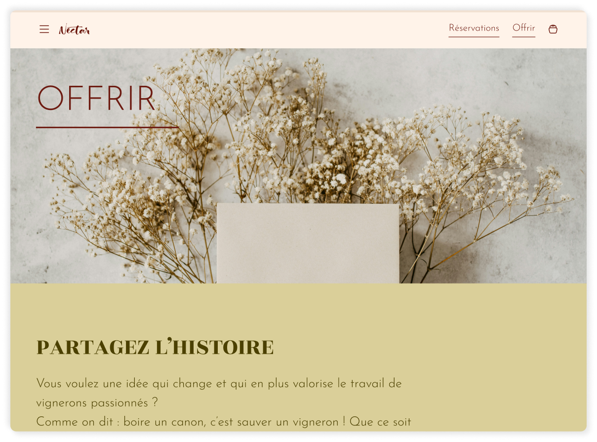
- Imagery: high-quality, emotional imagery and illustrations were selected to evoke the brand’s story and universe, with immersive full-width photos preferred over in-container displays.
- Layout: simple layouts with ample white space were used, ensuring that each element serves a purpose without overwhelming the user.
- Colors: natural tones and warm, earthy palettes were selected to create a grounded and inviting atmosphere.
- Navigation: intuitive and effortless navigation was designed to guide users smoothly through an inviting journey.
Optimizing layout and design
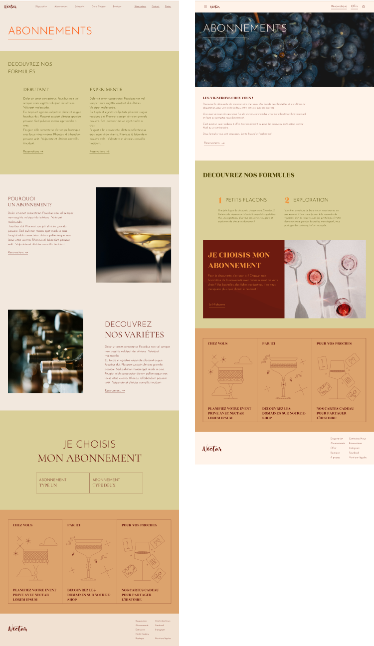
Once the main page wireframes were nearly complete, a review was conducted to optimize the layout and components using design psychology and cognitive biases to enhance the user experience and increase engagement:
Priming:
Previous stimuli influence decision-making.
Implication:
Avoid overwhelming users with the subscription choices upfront; position this section further down the page. Begin engaging users from the top of each landing page with bespoke imagery in the heading.
Progressive disclosure:
Users are less overwhelmed if they’re exposed to complex features later
Implication:
Present complex choices – such as subscription options – later in the user journey to maintain focus and reduce cognitive load.
Banner blindness:
Users tune out the stuff they get repeatedly exposed to
Implication:
Given that users are generally familiar with the benefits of subscription systems, provide only the most specific and relevant details about Nectar’s subscriptions in a short text.
Quantifying the optimization
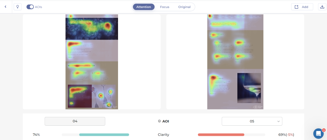
Heatmap tests conducted on the initial wireframes provided insights into which elements were most and least engaging. The test on the Subscription page revealed that the new layout (on the left) attracted more attention and engagement from users compared to the initial layout (on the right).
Concrete data from heatmap studies helped identify and enhance key user focus areas, allowing for validation of the final design components and layouts.
Illustrations
Illustrations uniquely capture a targeted and distinct look, representing a brand in ways no other graphic element can.
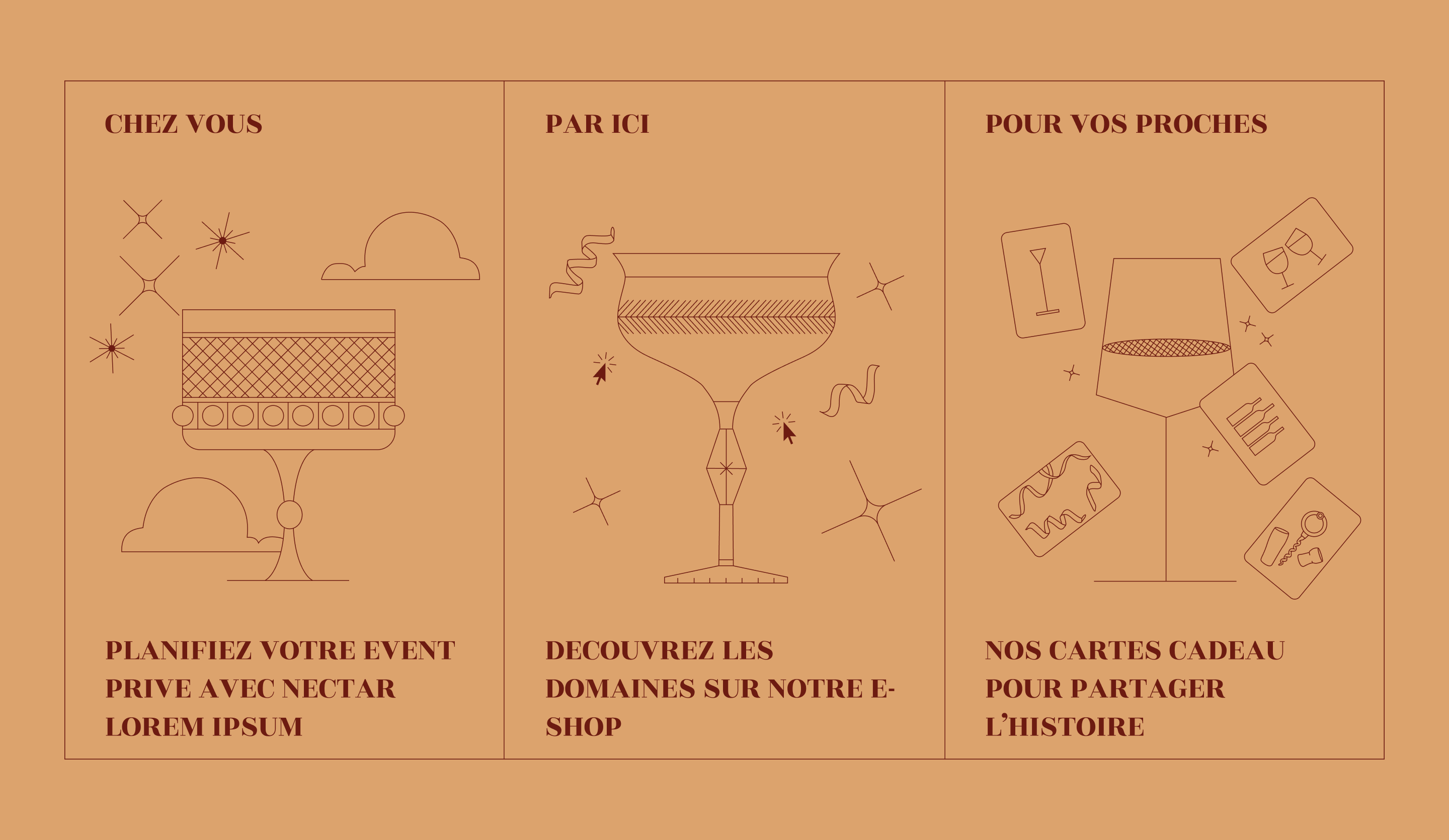
For Nectar, custom illustrations were crafted with a minimalist approach, featuring clean line art and a cohesive monochromatic palette. The design followed specific guidelines:
Shapes and elements
The illustrations needed to reflect the themes of the cards, including events, gift cards, and wine, blending real-life elements with abstract and digital touches.
Representation
The designs should be simple yet personal, ensuring they are striking and memorable to represent Nectar’s brand effectively without feeling overly simplified.
Composition
To soften the geometric and structured look, a sense of movement was added to each illustration, bringing them to life.
Following this project
The client expressed their satisfaction and desire to continue the collaboration by developing the e-shop section which is currently in progress.

