Thoughful departures: designing the offboarding experience for volunteers
Context
Team/role: Qomon/product designer
Users: volunteer
Product: mobile app
Time to complete: 3 days
This discovery is conducted in the framework of “breathing time”, which is a period of one week where the team works on issues unrelated to our roadmap’s cycles.
Problem statement
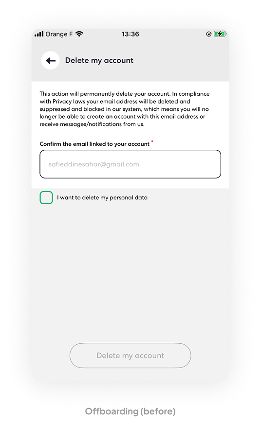
When a user wishes to delete their account on the mobile app, they are asked to provide their email address. How might we improve the offboarding experience?
Methodology
UX and strategic decisions should be data-driven. In light of very limited user-related data, this discovery is based on competitive analysis, best practices, and UX psychology.
As a business
The first part of the discovery focused on what we, as a business, hope to learn or gain from the user’s offboarding experience. Customers vividly remember the end of their experience with a company. If they leave with a negative impression, it not only hurts their experience but also affects what they share with friends and their network.
Getting recommended to potential users: as competition increases in every market, word-of-mouth marketing has become even more important.
Collecting feedback to improve the product: customer churn is one of the most important metrics to monitor.
Re-engaging users who return in the future: Some users who have churned might engage with the app again in the future.
Now, what are users interested in?
How might we deliver a great offboarding experience?
Competitive analysis
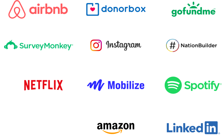
The analysis considers the offboarding experiences of select direct and indirect competitors (such as NationBuilder, GoFundMe, Airbnb, and Netflix) based on the following criteria:
- Ease to locate the action
- Feedback collection
- Communication style
- Retention attempts
- Closure implication mentions
- Time to complete task
- Overall experience
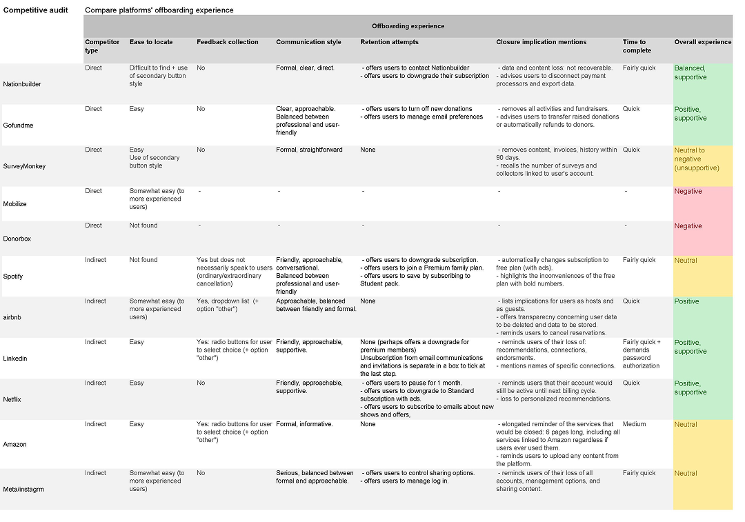
What can we learn from the analysis?
• OVERALL EXPERIENCE
Insight:
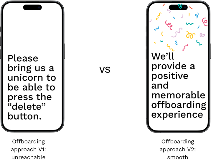
The overall experience should be quick, informative, supportive, and leave the user with a positive impression.
• USER JOURNEY
Insight:
Finding the path to cancel the account and locating the button should be a quick process. Failing to provide this option leaves a lasting negative impression of the brand.
Implementation:
Follow industry standards by placing the button on the account settings page, use an easily identifiable, appropriate CTA button.
• TONE OF VOICE
Insight:
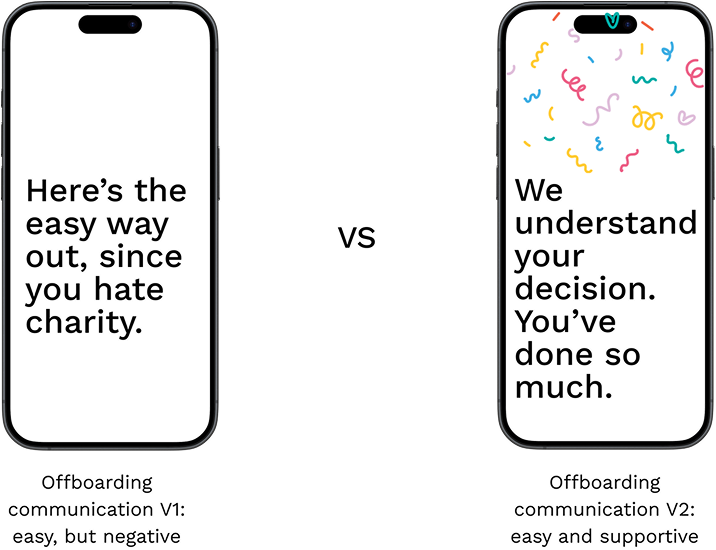
Positive offboarding is associated with a clear tone that strikes a balance between user-friendly and formal, while negative offboarding experiences are linked to a strictly informative, formal tone.
Implementation:
Use a supportive, informative, balanced tone of voice in the copy.
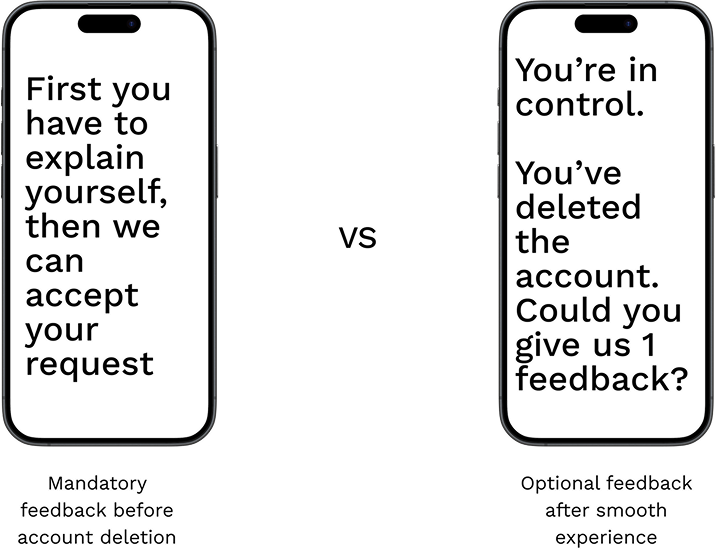
• FEEDBACK
Insight:
Although the examined direct competitors don’t request feedback, other industry leaders often do. When done promptly, this practice does not harm the user experience.
Implementation:
Identify a simple, non-time-consuming method to gather feedback from users without overwhelming them.
• EFFECTS OF CLOSURE
Insight:
All platforms communicate the effects of account closure, though some do so more gracefully than others, by overwhelming users with feelings of regret.
Implementation:
Be transparent with users about their data, account, and the main features they would lose access to. The tone of voice is crucial in this section.
• USER RETENTION
Insight:
Most platforms provide alternative options to account closure, such as downgrading subscriptions, pausing the account, or contacting customer support.
Implementation:
Explore alternative options to account closure while keeping in mind our users’ nature of engagement.
UX Psychology & best practices
Rule: Users disproportionately judge their experiences based on how they felt at the peak and at the end of their experience.
Implication: End on a positive note, celebrate users’ achievements and let them go.
Rule: The way information is presented affects user perceptions and decisions.
Implication: Copy quality is a major asset that contributes to users feeling supported and leads to a positive experience. When faced with a choice, users should not feel trapped or shamed but rather encouraged.
Rule: Give users something before asking for anything from them.
Implication: When users feel supported and experience a quick, smooth process, they are less likely to hesitate in providing feedback once they are reassured that they can achieve their goal of deleting their account.
Making choices
Post-deletion communication: leave out.
Some platforms choose to maintain communication with users after they have closed their accounts. Although this option can benefit the business and potentially re-engage users, the preferred approach here is to respect the user’s decision to leave.
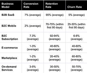
Churning conversion rates are quite low, so it’s better to let users go with dignity.
Right: conversion, retention, and churn benchmarks. Source: Remagine ventures on vccafe.com
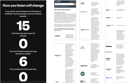
Highlighting what users are missing out on: handle with care
Although in some cases it can be beneficial to remind users of what they might “lose,” in our situation, it would be inappropriate to remind volunteers of what they will no longer be doing. In this context, users are givers, not takers or subscribers.
Right: Spotify and Amazon’s approach to highlighting what users are missing out on.
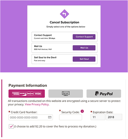
Dark patterns: avoid altogether
Some dark patterns that could be experiences while offboarding include:
- Manipulative copy to shame users into keeping their accounts.
- Obstruction, making it difficult for users to make a choice or even to find the way to delete their accounts.
- Nagging, by offering too many alternatives to account deletion, or by asking them multiple times to confirm their choice.
- Emotional framing, i.e. by including an option that goes against their intention.
Right: examples of user shaming and emotional framing as seen on other platforms.
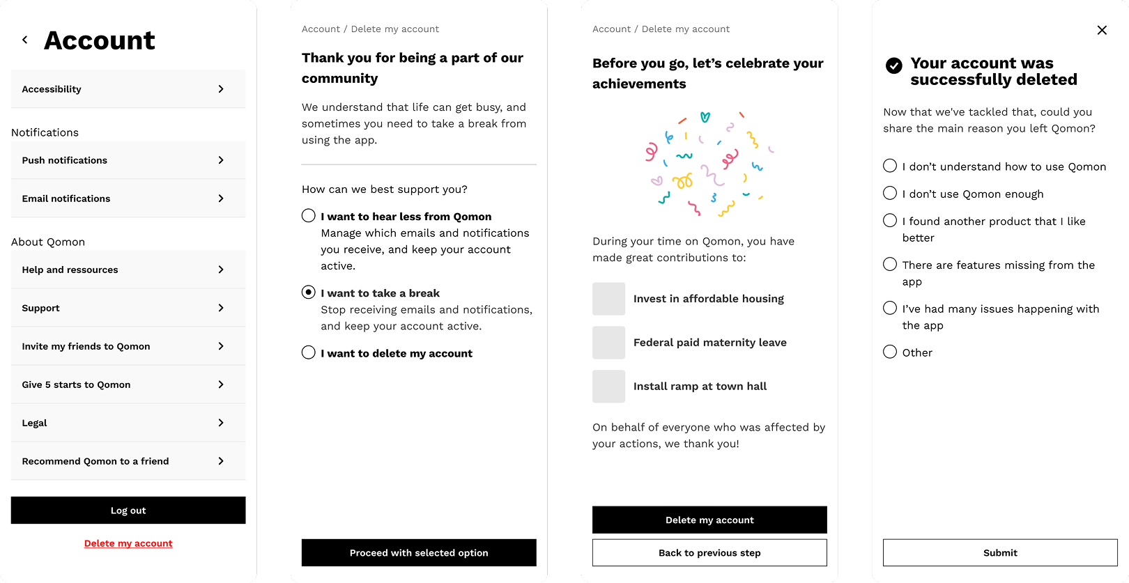
User journey
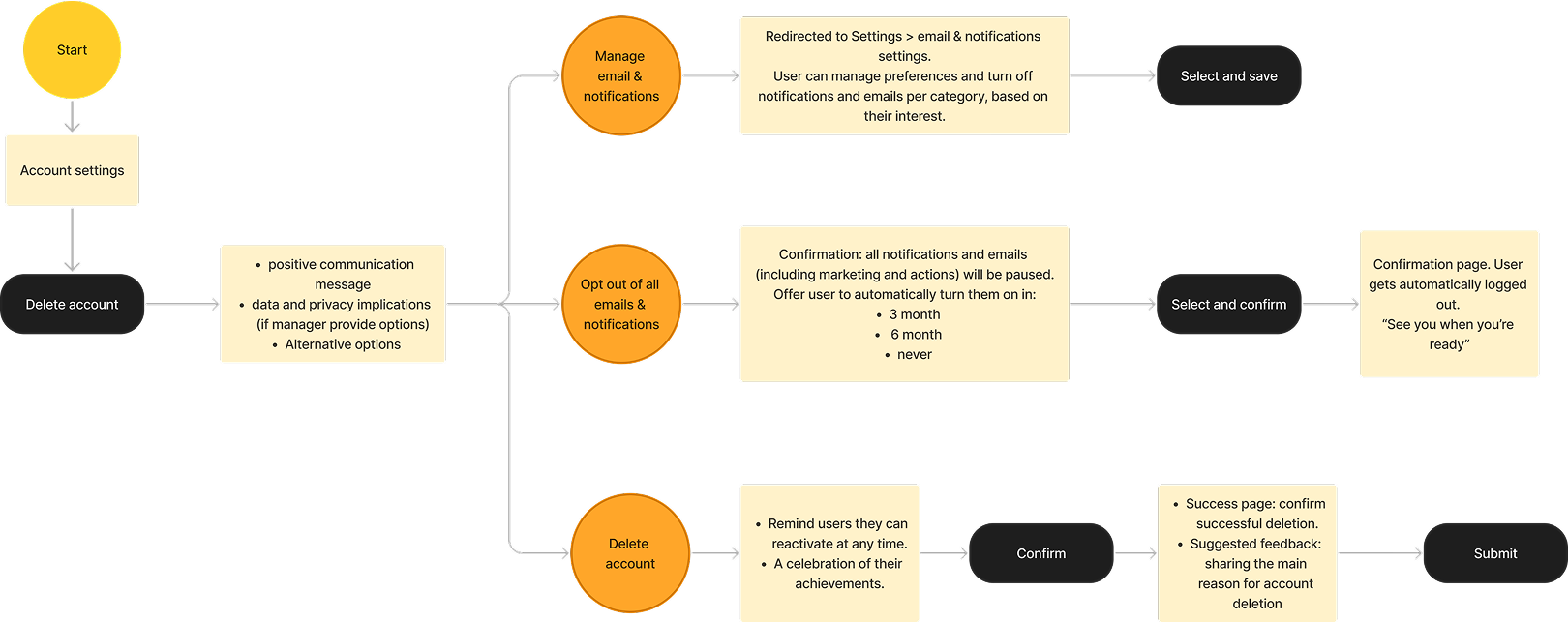
Low-fidelity wireframes
1
First impressions
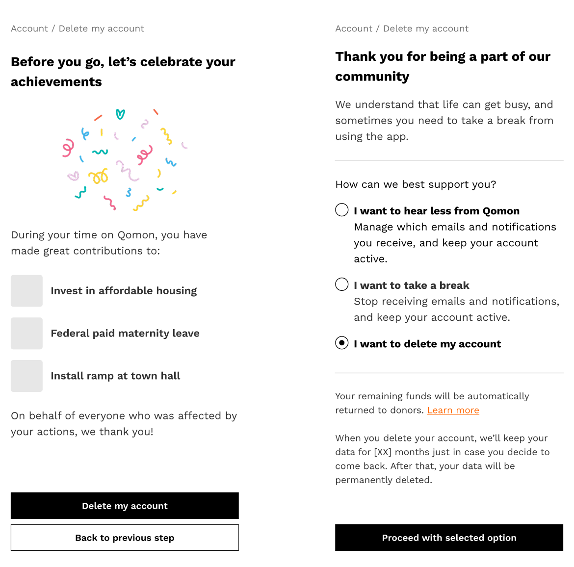
This first step is designed to make users feel supported and informed in their decision. They are made aware of the implications for their data before being presented with alternative options.
By framing the three options—from buttons to radio buttons—and preselecting the middle option, users may be more inclined to keeping their accounts active.
→ Center stage effect is a cognitive bias where people tend to accept the default option presented to them, which is typically the middle option.

2
Celebrating the departure
Jacob Nielsen writes, “You can’t impose joy.” Not even the best intentions and most carefully designed UX processes can guarantee positive emotions.
What we can do instead is invite users to remember and reflect on their meaningful contributions.
The peak-end rule is considered here, ensuring that the offboarding journey concludes on a user-centered, joyful note.
3
Success and feedback
Now that users have successfully achieved their goal through a quick and supportive journey, we can kindly request their feedback in return.
Based on the principle of reciprocity, users are more likely to provide a response.
By observing users’ behavior at this stage, we can later study the possibility of moving feedback collection to an earlier part of the offboarding process.
