Profile: decluttering a data analysis tool
Team
Qomon: data scientist, front-end developer, back-end developer, product designer
Role: product designer – conduct user interviews and lead the last round of iteration.
Product: Saas
Background
Qomon is a platform for political organizations and NGOs. It operates across three core areas:
- Organizing and leveraging contact databases (interactions, transactions, communication)
- Analyzing territorial data, including electoral, census, demographic, and socio-economic indicators
- Mobilizing volunteers in the field through canvassing, calling, and organizing events
Introducing the feature
Profile is a new feature built into the web app. Its purpose is to help users better understand their contact lists by cross-analyzing individual contact information with territorial data. The system then identifies areas where similar contacts may be found, allowing organizations to strategically focus their efforts and resources on priority zones.
When I joined the project, it was in the final stages of development and preparing for beta testing.
User feedback
Initial user feedback from beta testing revealed both enthusiasm and concerns.
While users appreciated the potential of the feature, there was a clear trust issue between users and the system.
We conducted interviews to understand this further and identified the following concerns related to trust and data transparency:
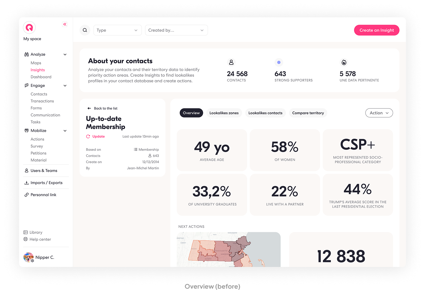
Mixed KPIs: the interface combined contact data and territorial data without clarifying their sources.
Irrelevant Information: some KPIs shown were not part of the profiling criteria, leading to confusion.
→ UX principle: aesthetic and minimalist design, interfaces should not contain information which is irrelevant.
Lack of Weighting Information: users couldn’t tell how much each data point influenced the profile.
Unclear System Logic, especially for users with knowledge in data science, the opacity of the model raised red flags.

Usability issues
In parallel to user interviews, our UX audit revealed several UX issues also emerged:
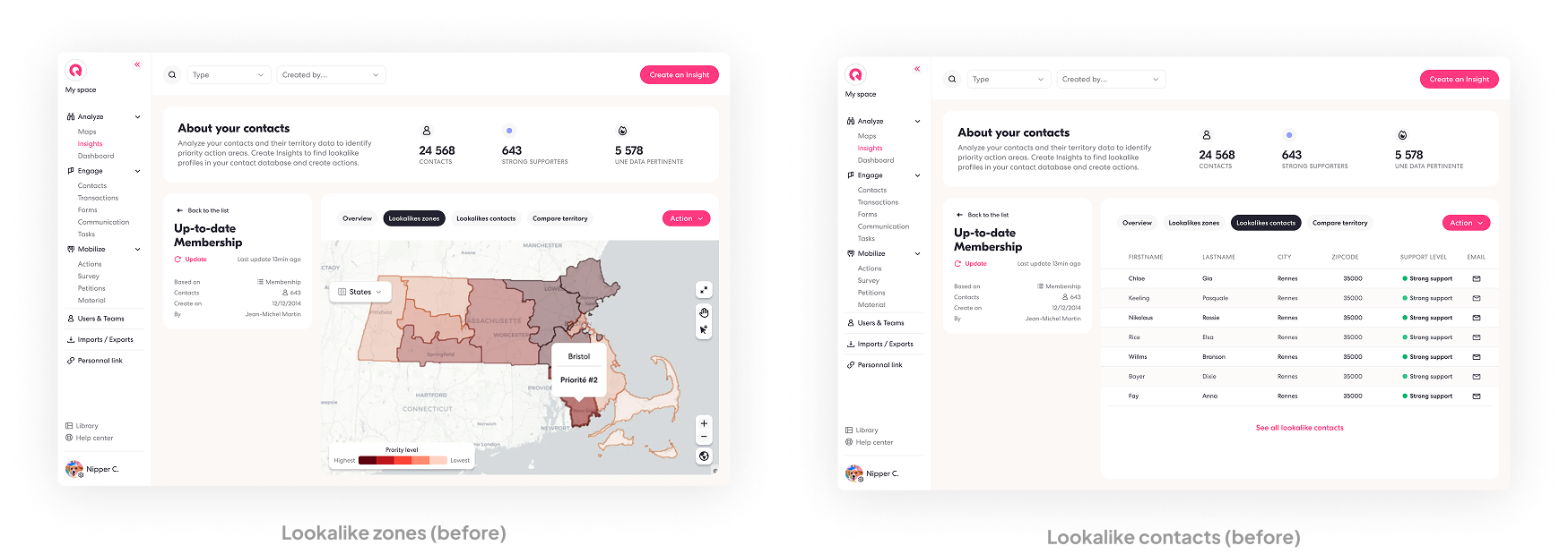
- Incomplete user flow: users can see “lookalike zones” and “lookalike contacts” but can’t filter, explore, or export results.
→ UX heuristic: mental models – A compressed model based on what we think we know about a system and how it works. When that expectation is broken, it causes friction and decreases trust in the tool.
- Disruptive navigation: moving between sections cases redirection without warning, breaking user flow and increasing cognitive load.
- Unclear system status: users aren’t informed of their analysis status when they are being redirected.These issues significantly weakened the overall experience and undermined user trust.
Improvements
Given tight time constraints, we proposed and implemented a series of pragmatic UX improvements:
1
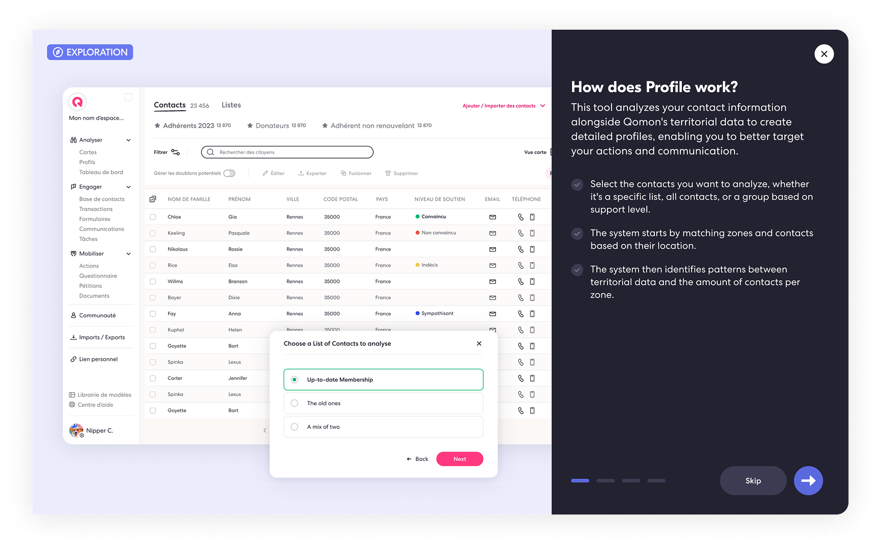
Add guidance
- On the main Profile page
- Within each section, so users can easily reference back
2
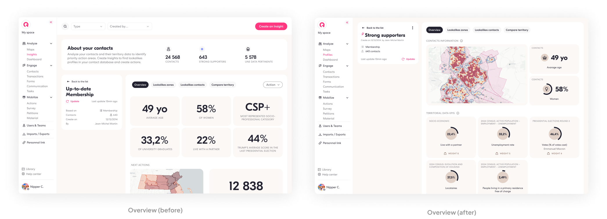
Reorganize the Overview screen
- Show only the contact data actually used in profile creation (age, gender, location)
- Clearly separate contact data from territorial KPIs
3
Inform users of system status and behavior
- Allow users to filter their results by priority before moving along with taking an action (communicating, organizing a field action)
- Add a step for redirection and give user control and information: If users are redirected to another section (map or contact list), they receive a message confirming their results are safe and autosaved
- This temporary solution was chosen due to time limitations, while keeping the ideal goal in mind: full interactivity within the same interface

Next steps
In the MVP, users can analyze contacts either based on their level of support or by selecting a specific contact list.
For the second version, we’re working on:
- Integrating the tool directly into the contacts database, allowing users to run analyses based on any filtering criteria
- Revamping the interface to align with other analysis tools in the platform, ensuring a more consistent and seamless experience across the product
