InsideU: a platform for kids to learn expressing their emotions
Background
Client: Renée Crown wellness institute – University of Colorado Boulder
Team: Liquid interactive – head of product, project manager, content writer, developers, UI/UX designer.
Role: lead designer
Visit: https://insideu.colorado.edu
Publications
Forbes USA, editor’s pick in the Innovation section
How “Inside Out” inspired a game where kids can meet and befriend their emotions – Link
Denver 7 news
CU’s Crown Institute partners with Pixar for emotional learning based on “Inside Out” movie – Link
Crown Institute
Crown Institute partners with Pixar to launch learning app for children based on Disney and Pixar’s animated film Inside Out – Link
Daps Magic
Crown Institute at the University of Colorado and Pixar Collaborate to Create ‘Inside Out’ – Kid’s Themed App – Link
Liquid Interactive
A theory for more effective engagement in digital learning – Link

Goals
The Liquid team collaborated with Colorado University’s Crown Institute to develop an accessible emotional education platform for children, focusing on entertainment.
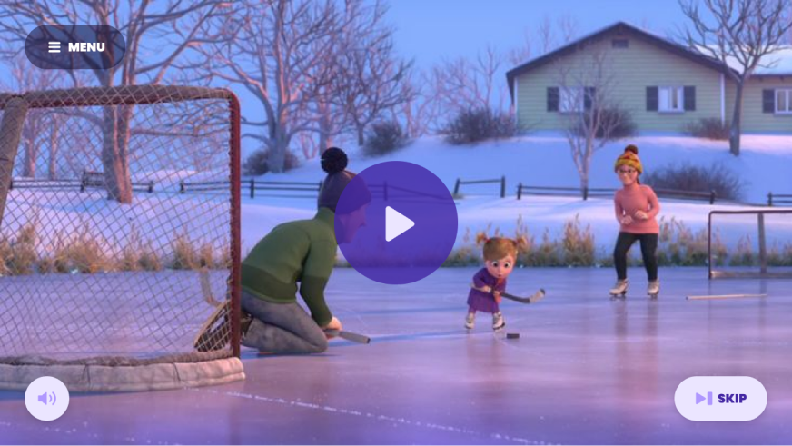
The product supports Social and Emotional Learning (SEL) and it is centered around the characters from Disney and Pixar’s Inside Out.
Upon joining the team, the first couple of episodes were already created and published on a temporary homepage. Our main objectives for the public release were:
To iterate on the Homepage design and build a permanent version.
To introduce a “for parents” section, providing information about the product and methodology
To oversee the script, animations, and designs for episodes 3 & 4
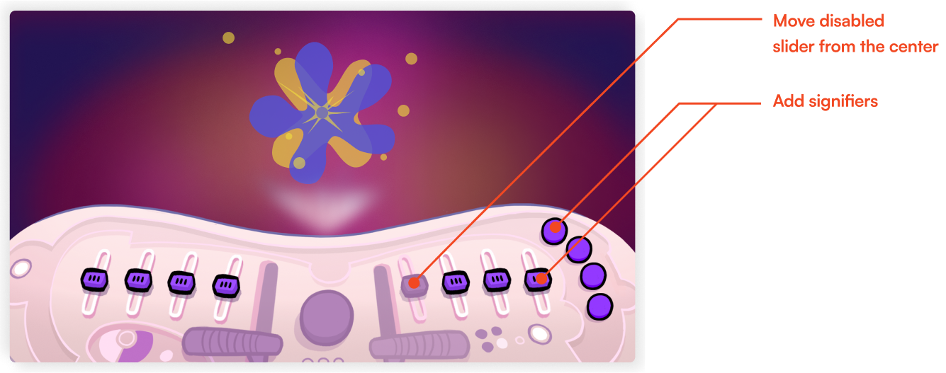
To design the console and visualizer feature for episodes 3 & 4
The console
The big questions for the console feature were:
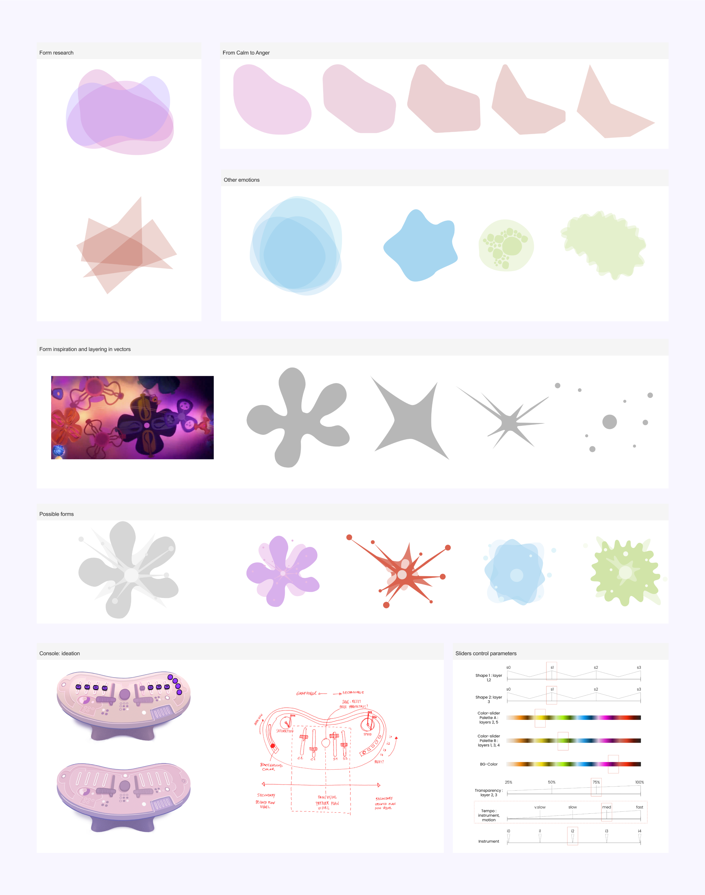
- which tools can help a child to represent their emotion? And what do emotions look like?
- what is the best experience that would assist the user in talking about their emotions?
We explored various parameters, including the shape, color, and sound. How does motion influence its environment? Does it move in space or is it static?
How many colors are sufficient to represent an emotion? Is one sound enough? Is one shape enough? How many shapes are too many shapes?
We drew inspiration from the Inside Out movie, while also exploring classic and modern music visualizers during the research phase. These visualizers provided insights into representing music’s rhythm and sensation in a technically feasible way.
Outline
Upon multiple rounds of iteration, we proceeded to establish rules for the sliders and the behavior of the shapes. This involved continuous testing, iteration, research, and adjustment, along with close collaboration across design, development, product, client, and management teams.
Eventually we reached a level of satisfaction where the visualizer hosted a range of display parameters and the visuals were diverse, satisfying, and engaging. We knew we had achieved our goal.
These implementations were based on known UX laws:
Principle:
Paradox of the active users: users will start using the platform immediately.
Implementation:
We should not bother with manuals but rather design a highly intuitive manual.
Principle:
Miller’s law, by which users can only keep 7 items in their working memory.
Implementation:
The number of interactive shapes must not exceed 7.
Principle:
Law of proximity, means that our users will group nearby sliders and mentally place them under the same umbrella.
Implementation:
We should group sliders in a logical and calculated manner.
Principle:
Jakob’s law, Reminding us that users spend most of their time on other platforms.
Implementation:
Our design should remain intuitive and align with basic children’s gaming behaviors.

The website
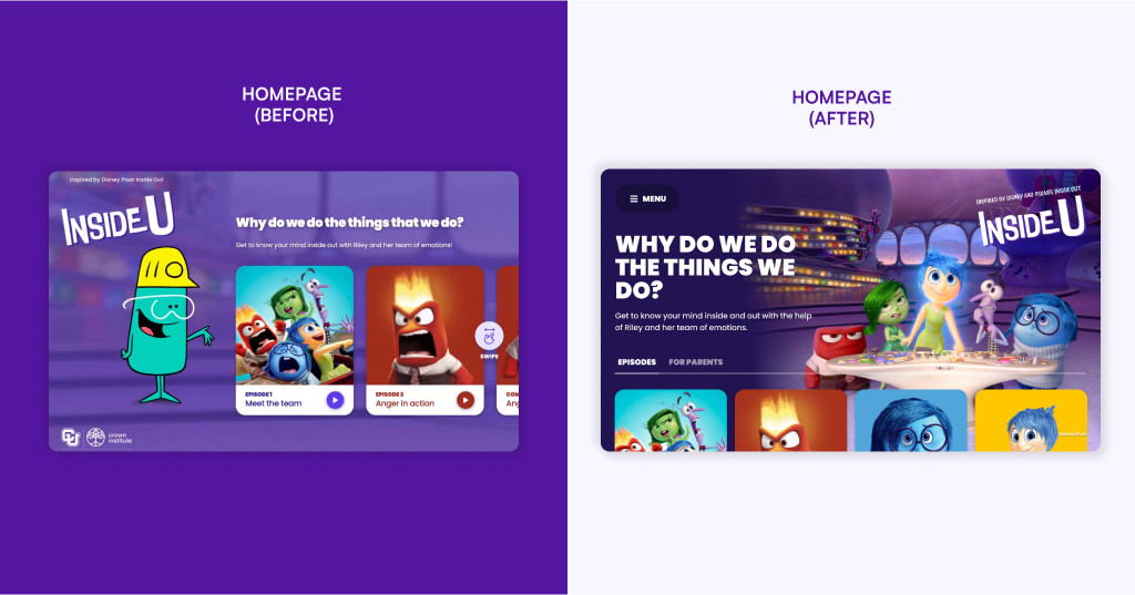
The episodes were initially grouped in a concise landing page that directed users to the episodes. Both the team and the client agreed on the need to iterate on the homepage design and user journey.
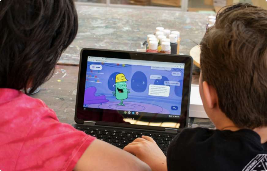
Designing a homepage for 10-year-old children and their parents is not the same as designing a homepage for adults.
Additionally, designing a homepage for 10-year-old children is not the same as designing a homepage for 8-year-old or 12-year-old children.
The Nielsen Norman Group shares valuable insights about UX for children. Based on their extensive research, we have adapted our UX and UI to follow best practices:
1
Children intuitively look for spatial navigation within a platform
We should not rely on keyboard shortcuts or browser navigation. Instead, we should provide navigation and action buttons integrated within the system, such as a copy button.

2
Young children tend to avoid scrolling, while older children are more accepting of it
We should use scrolling only when necessary and adjust the episode cards displayed on the landing page so that all are visible without requiring any action from the user.
3
Repetition enhances a child’s learning experience
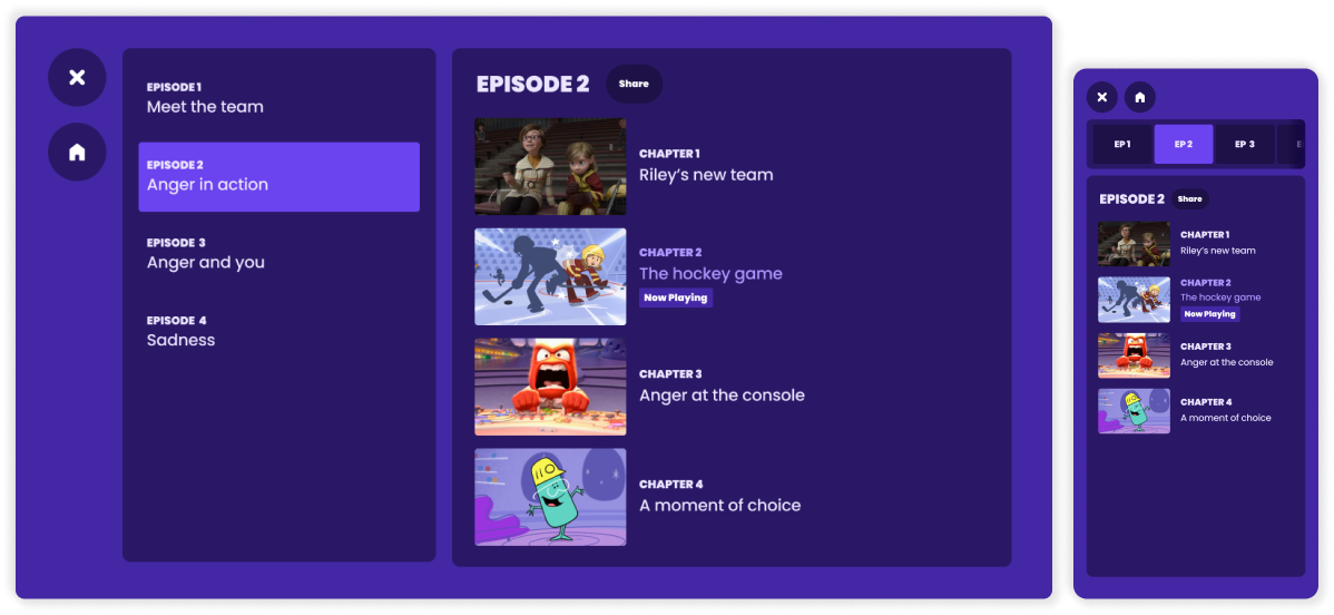
We want children to be able to “try again” as much as they like. To facilitate this, we will create an episodes menu and display episodes in chapters, allowing kids to select and repeat shorter segments of each episode.
4
Young children make tentative attempts at reading texts, older children scan texts
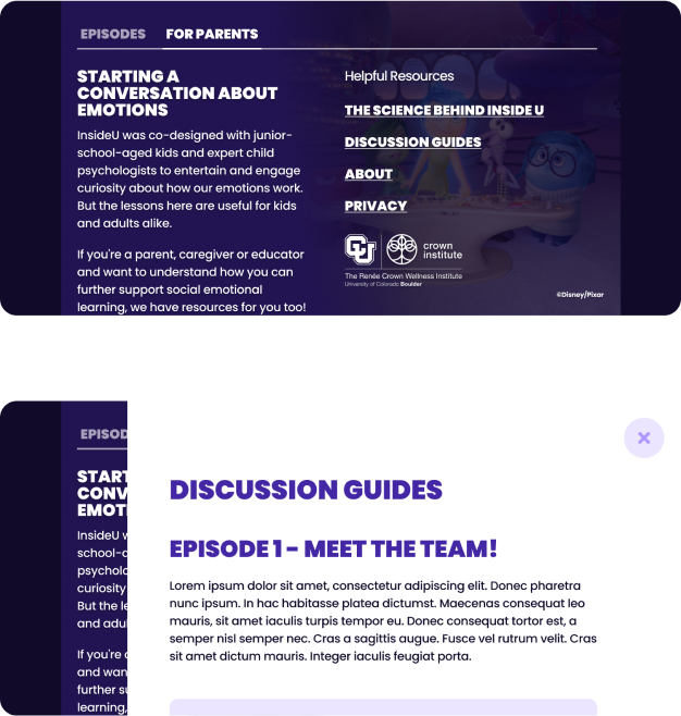
In the Episodes section dedicated for children, we kept texts short and supported them with visual elements to convey the ideas effectively. Meanwhile, we’ve reserved rich texts for the Parents section, where they can be explored in modals for those who want to dive deeper.
In retrospect
We would have gained from additional time to enhance the UX of both the Visualiser and the Console.

