DAUS: a service and guidance platform for users with dementia
Background
Client: Dementia Australia Organization
Team: Liquid interactive – producer, project manager, client engagement, content writer, developers, senior designer, UI/UX designer.
Role: Design system (contributor), design testing, illustrations.
Visit: https://www.dementia.org.au/
Goals
The multidisciplinary team at Liquid was tasked with creating the design system and brand identity for Dementia Australia’s digital products.
Our team was also tasked with creating a series of 34 illustrations of varying sizes that would be used on the client’s website.

Research insights
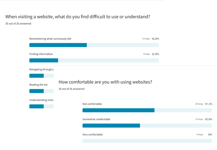
Based on a survey completed by 35 participants with different degrees of dementia, we were able to build our components based on grounded insights. For instance:
Users with dementia prefer large, easy-to-understand icons and buttons, with a UI featuring high-contrast, chunky buttons for better clarity.
They tend to favor websites with more images and minimal text to enhance clarity, valuing visual aids as a significant asset.
Users with dementia often feel overwhelmed by the amount of information on traditional websites. They benefit from layouts that present less information in the same space compared to other users.
Most testers prefer to seek assistance from a caregiver or family member. When that option isn’t available, or for those who aim for independence, providing a phone number for help is the next best alternative.

Implications on the components
1
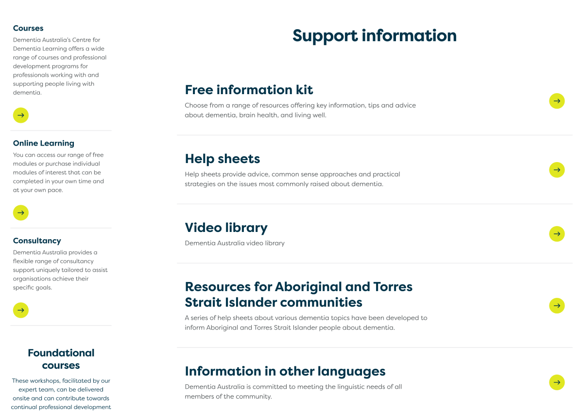
Card components
- display limited to 2 cards per row on desktop and 1 card per row on mobile.
- pair titles with bespoke visuals, as users rely heavily on imagery.
- use chunky UI buttons with recognizable icons.
- employ a friendly, easy-to-read font.

2
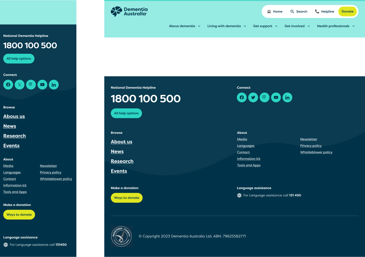
Navigation
- keep the helpline button consistently accessible in the header, as users may need help at any point in their journey.
- display the helpline phone number in the footer as an additional help option.
3
Link lists
- use larger font sizes: 20 pt for body text, 40 pt for titles, and 150% line height.
- ensure icons are simple, recognizable, and high-contrast.
- Use plain text at an 8th-grade reading level.
4
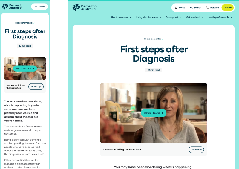
Video content
- provide transcripts for all videos and voice recordings.
- use ample white space and increased spacing.
- include breadcrumbs for easy navigation, as users might forget how they got to the page they are at.
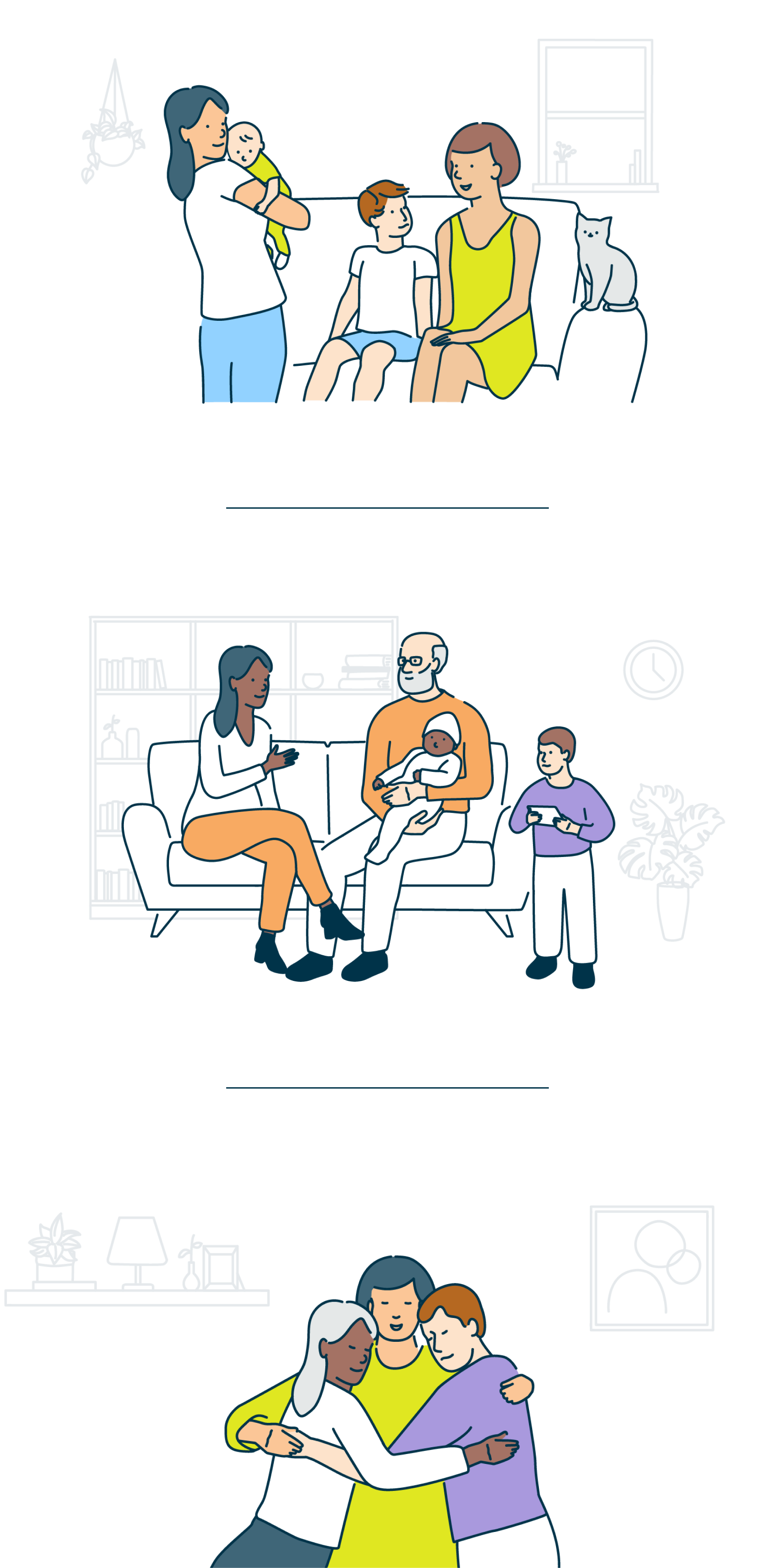
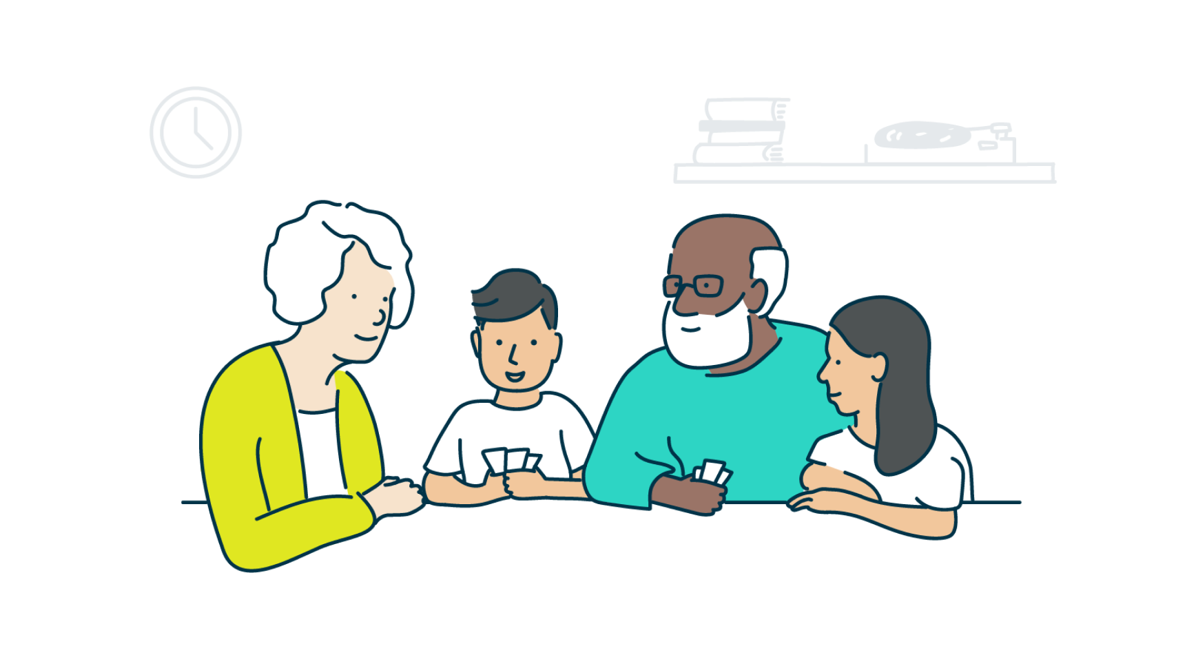
Illustrations
When users browse a page for information, illustrations can convey complex and abstract ideas in a simple way.
For users who struggle with dementia, a well-designed illustration is more memorable and identifiable than a photograph.
Illustrations should align with the brand, reflecting its values: respectful, inclusive, personal, and uplifting.
They must be clear and straightforward, avoiding unnecessary decorations and embracing simple shapes. Our illustration guide covered all aspects of the illustrations with a set of guidelines. In example:

Colors:
Limit clothing colors to a maximum of two per illustration to prevent images from becoming too busy.

Stroke:
Use rounded caps on stroke ends. Avoid sharp edges or joins; opt for rounded finishes whenever possible.

Background elements:
Use colorless background objects to add balance, context, and depth.
They should be faded to 10% opacity to help focus on the main characters. Limit background elements to a maximum of three to avoid clutter.

Clothing composition:
Restrict clothing details to main shapes and highlight only essential small details. Clothing colors should be solid blocks without patterns or textures.